Introduction to Data Science
Lesson 4: k-Means
These lecture notes are designed as accompanying material for the xAIM master's course. The course provides a gentle introduction to exploratory data analysis, machine learning, and visual data analytics. Students will learn how to accomplish various data mining tasks through visual programming, using Orange as our tool of choice for this course.
The notes were prepared by Blaž Zupan and Janez Demšar. Special thanks to Ajda Pretnar Žagar for the earlier version of the material. We would like to acknowledge all the help from the members of the Bioinformatics Lab at University of Ljubljana, Slovenia.
The material is offered under Create Commons CC BY-NC-ND licence.

Chapters
Chapter 1: k-Means
Hierarchical clustering is not suitable for larger data sets due to the prohibitive size of the distance matrix: with, say, 30 thousand data instances, the distance matrix already has almost one billion elements. If the matrix stores floating numbers that each requires 32 bits of memory, just storing such distance matrix would require a prohibitive 32 TB of working memory. An alternative approach that avoids using such large distance matrix is k-means clustering.
Notice that a squared distance matrix for hierarchical clustering is replaced with a matrix that stores the distances between all data points and k centers. Since k is usually small, this distance matrix can easily be stored in the working memory.
Clustering by k-means randomly selects k centers, where we specify k in advance. Then, the algorithm alternates between two steps. In one step, it assigns each point to its closest center, thus forming k clusters. In the other, it recomputes the centers of the clusters. Repeating these two steps typically converges quite fast; even for big data sets with millions of data points it usually takes just a couple of ten or hundred iterations.
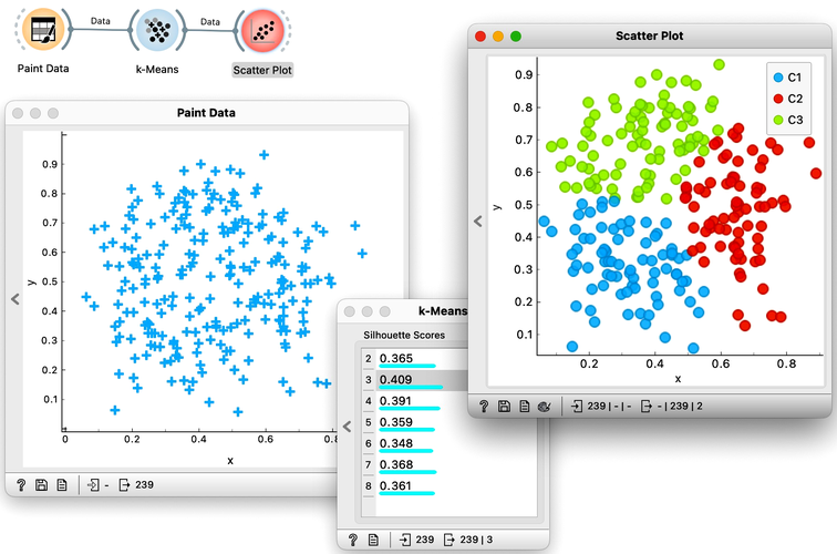
Orange's Educational add-on provides a widget Interactive k-Means, which illustrates the algorithm. To experiment with it, we can use the Paint Data widget to paint some data - maybe five groups of points. The widget would start with three centroids, but you can add additional ones by clicking anywhere on the plot. Click again on the existing centroid to remove it. With this procedure, we may get something like show bellow.
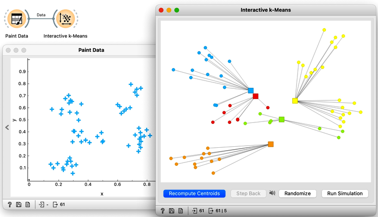
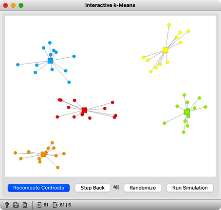
Now, pressing the return key, or clicking on Recompute Centroids and Reassign Membership button we can simulate the k-means algorithm. We can notice its fast convergence. The resulting clustering for the data we have painted above is shown below.
Try rerunning the clustering from new random positions and observe how the centers conquer the territory. Exciting, isn't it?
With this simple, two-dimensional data it will take just a few iterations; with more points and features, it can take longer, but the principle is the same.
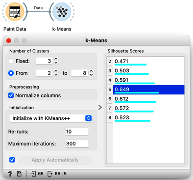
How do we set the initial number of clusters? That's simple: we choose the number that gives the optimal clustering. Well then, how do we define the optimal clustering? This one is a bit harder. We want small distances between points in the same cluster and large distances between points from different clusters. Oh, but we have already been here: we would like to have clustering with large silhouette scores. In other words: we can use silhouette scoring and, given the clustering, compute the average silhouette score of the data points. The higher the silhouette, the better the clustering.
Now that we can assess the quality of clustering, we can run k-means with different values of parameter k (number of clusters) and select k which gives the largest silhouette. For this, we abandon our educational toy and connect Paint Data to the widget k-Means. We tell it to find the optimal number of clusters between 2 and 8, as scored by the Silhouette.
Works like a charm.
Except that it often doesn't. First, the result of k-means clustering depends on the initial selection of centers. With unfortunate selection, it may get stuck in a local optimum. We solve this by re-running the clustering multiple times from random positions and using the best result. Or by setting the initial position of centroids to the data points that are far away from each other. Or by slightly randomizing this selection, and running the whole algorithm, say, ten times. This later is actually what was proposed as KMeans++ and used in Orange's k-Means widget.
The second problem: the silhouette sometimes fails to correctly evaluate the clustering. Nobody's perfect.
The third problem: you can always find clusters with k-means, even when they are none.
Time to experiment: use the Paint Data widget, push the data through k-Means with automatic selection of k, and connect the Scatter Plot. Change the number of clusters. See if the clusters make sense. Could you paint the data where k-Means fails? Or where it works really well?
Chapter 2: k-Means on Zoo
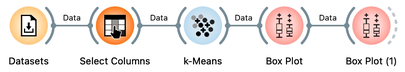
There will be nothing much new in this lesson. We are just assembling the bricks we have encountered and constructing one more new workflow. But it helps to look back and admire what we have learned. Our task will be to take the zoo data set, find clusters and figure out what they are. We will get the zoo data set from the Datasets widget. It includes data on 100 animals characterized by 16 features. The data also provides animal names and the type of animal stored in the class column.
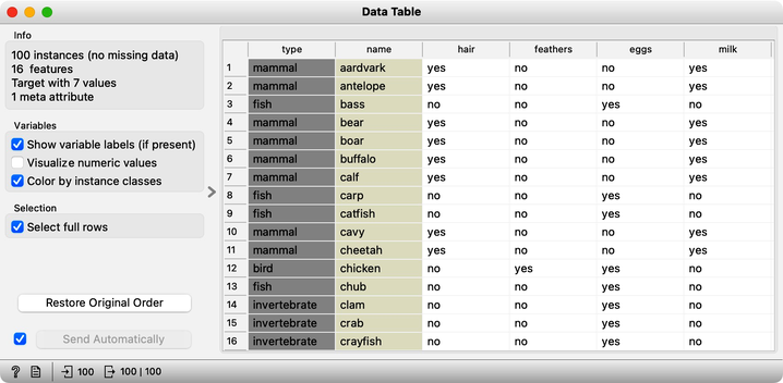
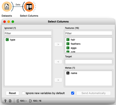
For a while, we will pretend we do not know about the animal type and remove the "type" variable from the data using the Select Columns widget.
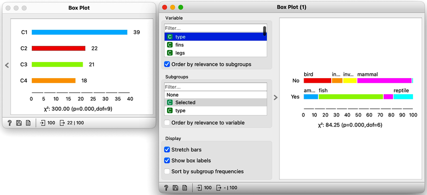
The widget k-means tells us there may be four or five clusters; the silhouette score differences for these two values of k are tiny. The task here is to try to guess which types of animals are in which cluster and what their characteristics are. We could go ahead in several ways, and to select the target cluster, we are tempted to say that we should use the Select Rows widget, which would be appropriate. But instead, let us use the Box Plot for cluster selection and another Box Plot to analyze and characterize clusters.
On the first Box Plot: the k-Means widget adds the feature that reports for each data instance on the cluster membership. No wonder the feature is called "Cluster". We use the box plot to visualize the number of data instances in each cluster and to spread the visualization into separate rows, and we will subgroup the plot by the same feature:
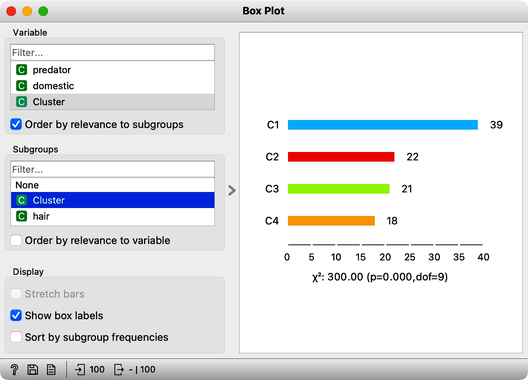
We will use this Box Plot for cluster selection: click on any of the four bars (four is the number of clusters we selected in the k-Means widget), and Box Plot will output the data instances belonging to this cluster. We will not care about the selected data but rather pour the entire data set into the next Box Plot. Remember to rewire the connection between two Box Plots accordingly. When outputting the entire data set, the Box Plot will add the column "Selected" to report whether the data instance was selected. In our case, the Selected column will report if the data instance belongs to our target cluster. At this stage, this is our workflow:
Now for the fun part. We can select the first cluster to find that the feature that most define it are milk, hair, and eggs. Examining this further, we find that all the animals in the first clusters give milk, have hair, and do not lay eggs. Mammals.
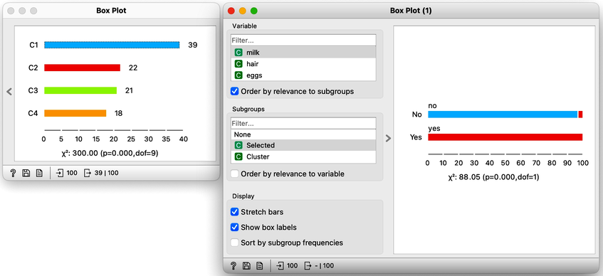
In the second (red) cluster, most animals have fins, no legs, and are aquatic. Fish. But there are also some other animals with four legs and no fins, so this cluster is a bit of a mixture. The third cluster is easier, as there are animals with feathers with two legs. Fish. Animals in the fourth cluster have no backbone and are without tails. This cluster is a harder one, but with some thinking, one can reason these are insects or invertebrates.
There are many more things that we can do at this stage, and here are some ideas:
-
Link the output of the last Box Plot to the Data Table and find out what the animals with specific characteristics are, that is, what their name is.
-
Check for some outliers. Say, two animals give milk but are not in the first (mammalian) cluster. Which ones are these?
-
Go back to Select Columns, place the type in the meta-features list, and check out the distribution of animal types in the selected cluster.