Introduction to Data Science.
Lesson 2: Hierarchical Clustering
These lecture notes are designed as accompanying material for the xAIM master's course. The course provides a gentle introduction to exploratory data analysis, machine learning, and visual data analytics. Students will learn how to accomplish various data mining tasks through visual programming, using Orange as our tool of choice for this course.
The notes were prepared by Blaž Zupan and Janez Demšar. Special thanks to Ajda Pretnar Žagar for the earlier version of the material. We would like to acknowledge all the help from the members of the Bioinformatics Lab at University of Ljubljana, Slovenia.
The material is offered under Create Commons CC BY-NC-ND licence.

Chapter 1: Distances in 2D
Clustering, that is, the detection of groups of objects, is one of the basic procedures we use to analyze data. We can, for instance, discover groups of people according to their user profiles through service usage, shopping baskets, behavior patterns, social network contacts, usage of medicines, or hospital visits. Or cluster products based on their weekly purchases. Or genes based on their expression. Or doctors based on their prescription.
Most popular clustering algorithms rely on relatively simple algorithms that are easy to grasp. In this section of our course, we will introduce a procedure called hierarchical clustering. Let us start, though, with the data and with the measurement of data distances.
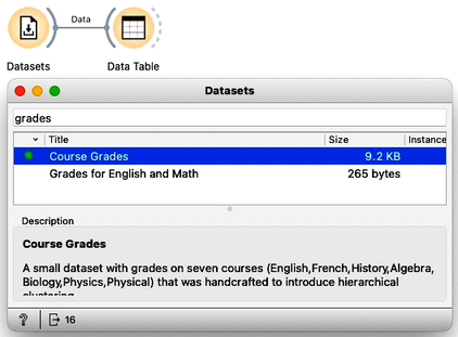
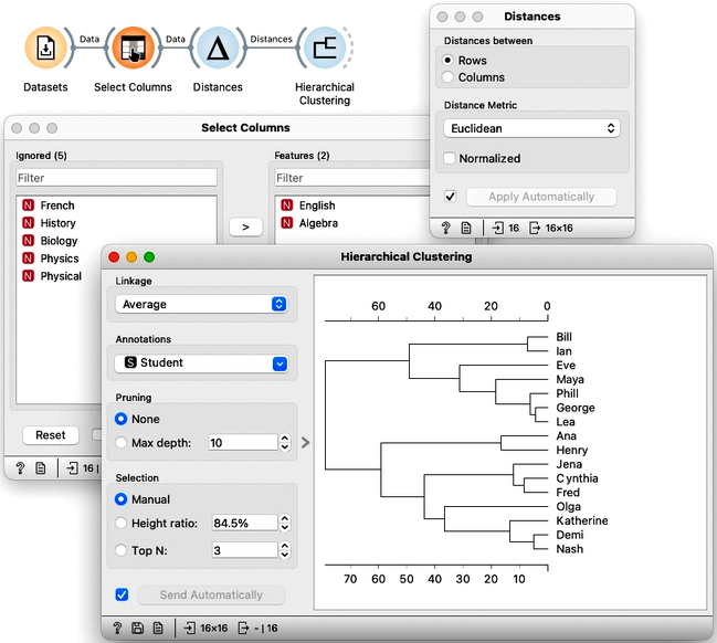
We will use the data on student grades. The data is available through Orange’s Datasets widget. We can find it by typing "grades" in the filter box. We can examine this data in the Data Table. Sixteen students were graded in seven different subjects, including English, French, and History.
We would like to find students whose grades are similar. Teachers, for instance, may be interested to know if they have students talented in different areas so that she can adjust their training load appropriately. While, for this task, we would need to consider all the grades, we will simplify this introduction to consider only grades from English and Algebra, constructing, in this way, a two-dimensional data set.
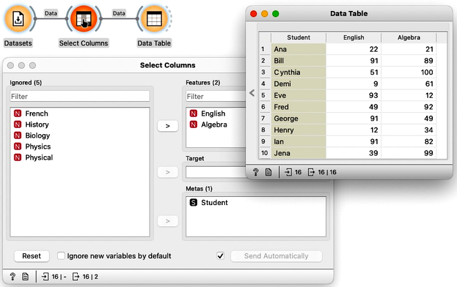
To select only specific variables from the data, we can use the Select Columns widget. We will ignore all features except English and Algebra. We can do this by selecting all the features, moving them to the Ignored column, and then dragging English and Algebra back to the Features column. It is always good to check the results in the Data Table.
Here, we selected English and Algebra for no particular reason. You can repeat and try everything from this lesson with some other selection of feature pairs.
Since we have the data with only two features, it is best to see it in the Scatterplot. We can label the dots representing students with their names.
If all the data on this planet would be two-dimensional, we could do all the data analysis in the scatter plots.
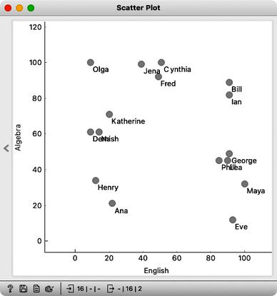
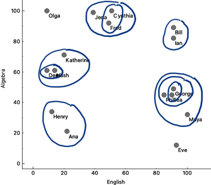
We can see Olga with a high math grade on the top left and Maya in the opposite corner of the plot. They are really far apart and definitely would not be in the same cluster. On the other hand, George, Phil, and Lea have similar grades in both subjects, and so do Jena, Cynthia, and Fred. The distances between these three students are small, and they appear close to each other on the scatterplot.
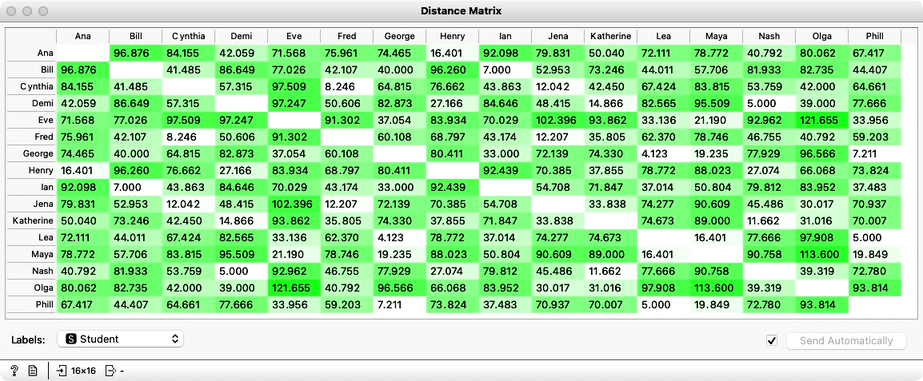
There should be a way to formally measure the distances. In real life, we would just use a ruler and, for instance, measure the distance between Katherine and Jena by measuring the length of the line that connects them. But since Orange is a computer program, we need to tell it how to compute the distances. Well, Katherine’s grade in English is 20, and Jena’s is 39. Their English grade difference is 19. Katherine scored 71 in Algebra and Jena’s 99. The algebra grade difference is 28. According to Pythagoras, the distance between Katherine and Jena should be a square root of 19 squared plus 28 squared, which amounts to about 33.8.
We could compute distances between every pair of students this way. But we needn't do it by hand, Orange can do this for us.
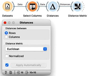
We will use the Distances widget and, for now, remove normalization. The grades in English and Math are expressed in the same units, so there is no need for normalization now. We’ll keep the distance matrix set to Euclidean distance, as this is exactly the one as we have defined for Katherine and Jena.
Warning: the Normalization option in the Distances widget should always be on. We have switched it off just for this particular data set to compare the computed distances to those we have calculated by hand. Usually, the features are expressed in different scales. To jointly use these features in the computation of the Euclidean distances, we have to normalize them.
We can look at the distances in the Distance Matrix, label the columns and rows with student names, and find that the distance between Katherine and Jena is indeed 33.8, as we have computed before.
We now know how to compute the distances in two-dimensional space. The idea of clustering is to discover groups of data points, that is, students, whose mutual distance is low. For example, in our data, Jena, Cythia and Fred look like a good candidate group. And so do Phil, Lea and George. And perhaps Henry and Ana. Well, we would like to find the clustering for our entire set of students. But how many clusters are there? And what clustering algorithm to use?
Chapter 2: Cluster Distances
For clustering, we have just discovered that we first need to define the distance between data instances. Now that we did, let us introduce a simple clustering algorithm and think about what else we need for it.
When introducing distances, we worked with the grades data set and reduced it to two dimensions. We got it from the Datasets widget and then use Select Columns to construct a data set that contains only the grades for English and Algebra.
The Hierarchical Clustering algorithm starts by considering every data instance - that is, each of our students - as a separate cluster. Then, in each step, it merges the two closest clusters. Demi and Nash are closest in our data, so let’s join them into the same cluster. Lea and George are also close, so we merge them. Phil is close to the Lea-George cluster, and we now have the Phil-Lea-George cluster. We continue with Bill and Ian, then Cynthia and Fred, and add Jena to the Cynthia-Fred cluster, Katherine to Demi-Nash, and Maya to Phil-Lea-George, Henry joins Ana, and Eve joins Phil-Lea-George-Maya. And now, just with a quick glance – and we could be wrong – we will merge the Bill-Ian cluster to Jena-Fred-Cynthia.
For the two-dimensional data, we could do hierarchical clustering by hand, in each iteration circling the two clusters we join into a group.
 Single linkage.
Though, hold on! How do we know which clusters are close to each other? Did we actually measure the distances between clusters? Whatever we have done so far was just informed guessing. We should be more precise.
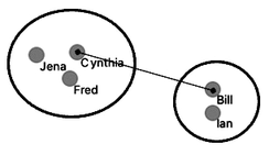
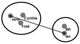
Say, how do we know that Bill-Ian should go with Jena-Cynthia-Fred, and to George-Phil-Lea and the rest? We need to define the computation of distances between clusters. Remember, in each iteration, we said that hierarchical clustering should join the closest two clusters. How do we measure the distance between Jena-Cynthia-Fred and Bill-Ian clusters? Note that what we have are the distances between data items, that is, between individual students.
 Complete linkage.
How do we actually make sure what are the distances betwen clusters? There are several ways to measure the distances between clusters. In the simplest, we can define cluster distance as the distance between two of their closest data items. We call this distance a “single linkage”. Cynthia and Bill are the closest. If we use a single linkage, this distance defines the distance between two clusters.
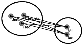
We could also take two data instances that are the farthest away from each other and use their distance to define the cluster distance. This is called “complete linkage”; if we use it, Jena and Ian represent the cluster distance.
In a third variant, we would consider all the pairwise distances, say, between Ian and Cynthia, Ian and Fred, Bill and Cythia, Bill and Jena, Bill and Fred, and from them compute the average distance. This is, not surprisingly, called the “average linkage”.
 Average linkage.
Now we have just defined the second ingredient we need for hierarchical clustering, besides ways to measure the distance between data items, is the way to compute the distance between clusters. Before, when we started to join clusters manually, we used just a sense of closeness, probably something similar to average linkage. Let us continue in this way for just a while.
We will join the Henry-Ana cluster to Demi-Nash-Katherine, and perhaps merge Olga with a cluster on the right. We will then add the top cluster to the one on the bottom right – although here, we do not know exactly which solution is the best. We would need something like Orange to compute cluster distances for me. Finally, we can merge the remaining two clusters.
Here our merging stops. There’s nothing else we can merge. The hierarchical clustering algorithm stops when everything is merged into one cluster. Below is the result of hierarchical clustering on my two-dimensional data set of student grades.
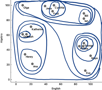
Our depiction of clustering looks, at best, a bit messy, but somehow still shows a clustering structure. There should be a better, more neat way to present the clustering results. And we still need to find a way to decide the number of clusters.
Chapter 3: Dendrograms
So far, we have reduced the data we used in an example for hierarchical clustering to only two dimensions by choosing English and Algebra as oot features. We said we could use Euclidean distance to measure the closeness of two data items. Then, we noted that hierarchical clustering starts with considering each data item in its own cluster and iteratively merges the closest clusters. For that, we needed to define how to measure distances between clusters. Somehow, intuitively, we used average linkage, where the distance between two clusters is the average distance between all of their elements.
In the previous chapter, we simulated the clustering on the scatter plot, and the resulting visualization on the scatter plot was far from neat. We need a better presentation of the hierarchical clustering results. Let's, again, start with the data set, select the variables, and plot the data in the scatter plot.
Let's revisit the English-Algebra scatter plot. When we join the two clusters, we can remember the cluster distance and plot it in a graph. Say, we join George and Lea, where their distance is about 5. Then we could add Phil to the George-Lea cluster, with the distance, say, 6. Then Bill and Ian with a distance of 7. And then, a while later on, I add Maya to Phil-Lea-George at a distance of 15. We can represent this merging of the clusters in a graph, hand-drawn here in the depiction below.
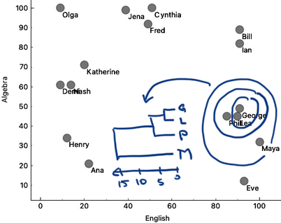
The cluster merging graph that we are showing here is called a dendrogram. Dendrogram visualizes a structure of hierarchical clustering. Dendrogram lines never cross, as the clustering starts with clusters close to each other, and cluster distances we find when iteratively merging the clusters grow larger and larger.
To construct hierarchical clustering in Orange, we first need to measure distances. We have done this already in a previous chapter, where we used Distances widget. We will use Euclidean distance, and only for this data set, we will not normalize the data. We now use these distances, send them to Hierarchical Clustering widget and construct the dendrogram.
We are still working on the two-dimensional data set, hence the use of Select Columns to pick only English and Algebra grades from our example dataset.
We may remember from our writing on distances that Lea, George, and Phil should be close, and that Maya and Eve join this cluster later. Also, the distance between Bill and Ian is small, but they are far from the George-Lea-and-the-others cluster. We can notice all these relations, and inspect the entire clustering structure from the dendrogram above.
We can now cut the dendrogram to expose the groups. Here, we cut it such that we get three clusters. Where are they in the scatter plot? The Hierarchical Clustering widget emits the Selected Data signal. Here, by cutting the dendrogram, we selected all the data instances, so it should also include the information on the clusters.
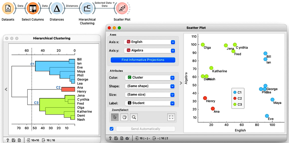
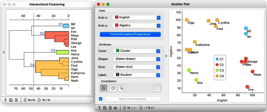
We can use this workflow to experiment with the number of clusters by placing the cutoff line at different positions. Here is an example with four clusters where Bill and Ian are on their own. No wonder, as they are the only two performing well in both English and Algebra.
How many clusters are there in our data? Well, this is hard to say. Dendrogram visualizes the clustering structure, and it is usually up to domain experts, in this case, the teachers, to decide what they want. In any case, it is best to select the cut-off for the clustering where the number of clusters would not change under small perturbation of the data. Note, though, that everything we have done so far was on the two-dimensional data. We now need to move to higher number of dimensions.
Chapter 4: High Dimensions
So far we have performed hierarchical clustering in two dimensions. We used the course grades dataset, selecting only the scores in English and Algebra, and visualized them on a scatter plot. There, we developed the concepts of instance distances and distances between clusters. As a refresher: to measure the distance between two students, say, we summed the squared differences between their grades in Algebra and English. We referred to this as the Euclidean distance and noted that it comes from the Pythagorean theorem.
Just as a side note: using Euclidean distance with data with large number of dimensions hits the problem called the curse of dimensionality, where everything becomes similarly far away. We will skip this problem for now and assume Euclidean distance is just fine for any kind of data.
Now what happens if we add another subject, say History? The data would then be in three dimensions. So we would need to extend our Euclidean distance and add the squared difference of grades in History. And, if we add another subject, like Biology, the distance equation gets extended with the squared differences of those grades as well. In this way, we can use Euclidean distance in a space with an arbitrary number of dimensions.
So, what about distances between clusters, that is, linkages? They stay the same as we have defined them for two dimensions as they depend only on the data item distances, which we now know how to compute.
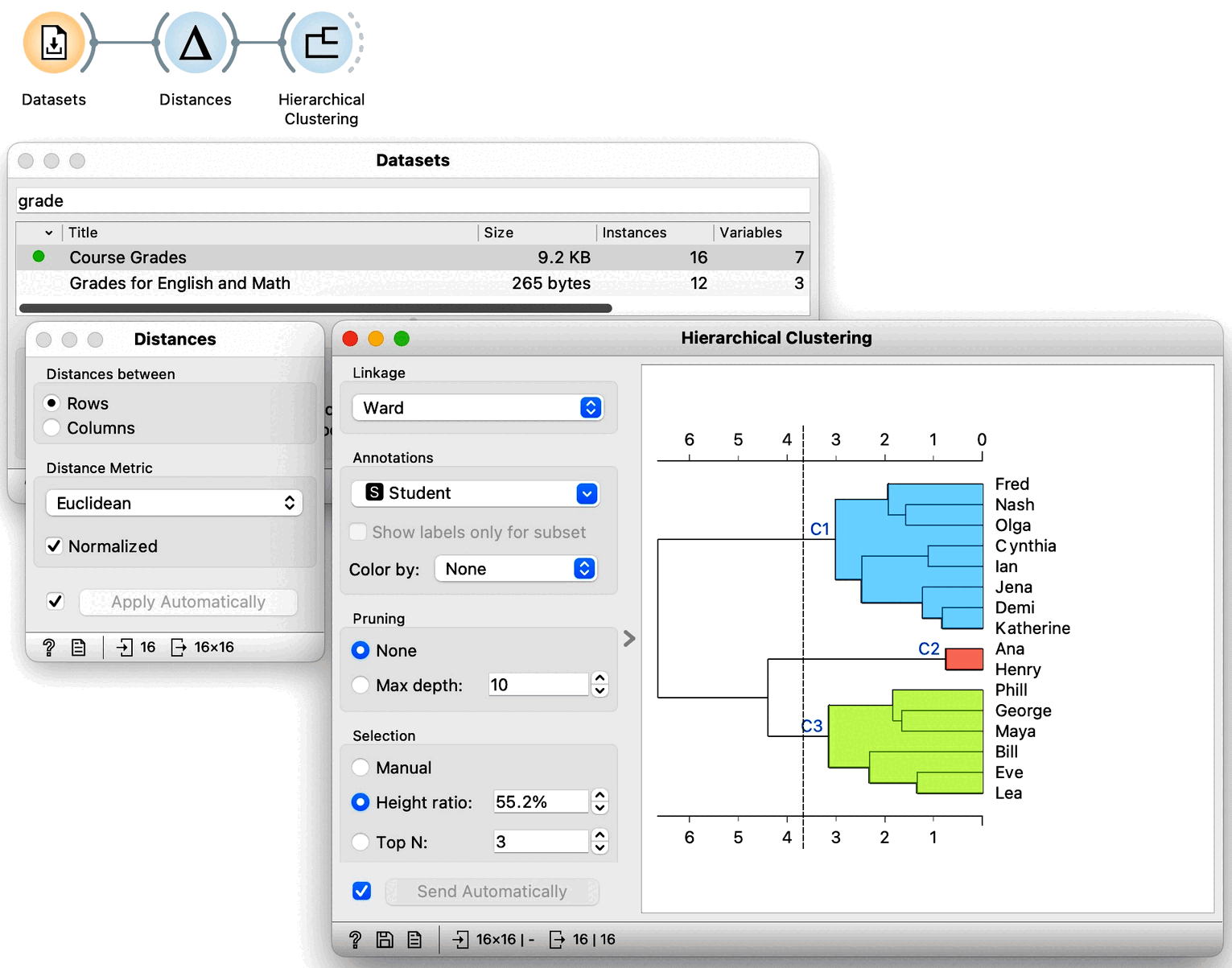
Equipped with this new knowledge, that is, with the idea that Euclidean distance can be used in arbitrary dimensions and that we can used already introduced linkages between clusters, we can now try clustering our entire dataset. We load the grades data in Datasets widget and get the distances between all the pairs of data instances so we can perform our hierarchical clustering. To make sure: we can again use Euclidean distance, and perhaps normalize the features this time. Let us not forget that we need use normalization when variables have different ranges and domains. Now taking a look at the dendrogram we can see that our data may include three clusters.
We would now like to get some intuition on what these clusters represent. We could, in principle, use Scatter Plot to try to understand what happened, but now we have seven-dimensional data, and just peeking at two dimensions at a time won’t tell me much. Let us take a quick look anyway by adding a Scatter Plot at the output of Hierarchical Clustering. Here is the data projected onto the Algebra-English plane.
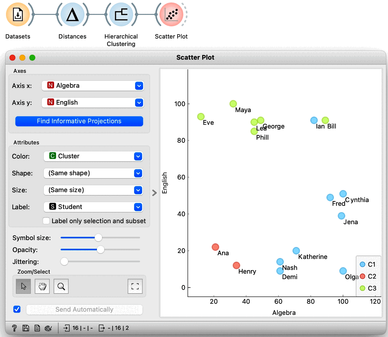
The students with similar grades in these two subjects are indeed in the same cluster. However, we also see Bill and Ian close together but in different clusters. It seems we are going to need a different tool to explain the clusters. Just as a hint: we have already used the widget that we will use for cluster explanation in the section on data distributions. But before we jump to explaining clusters, which is an all-important subject, let us explore the clustering of countries using human development index data. And use geo-maps to visualize the results.