This quiz consists of 0 mandatory questions where you can gather 0 points.
You will complete the quiz by answering all the questions and gathering at least 0 points.
Answered: 0 / 0
Achieved points: 0 (NaN %)
Logistic Regression
Guided self-study
Artificial intelligence, as we currently know it, is simple. No kidding. In essence, AI of today is just like throwing some crosses and circles on a paper, and finding a line that separates them. Like, for instance, in the figure below.
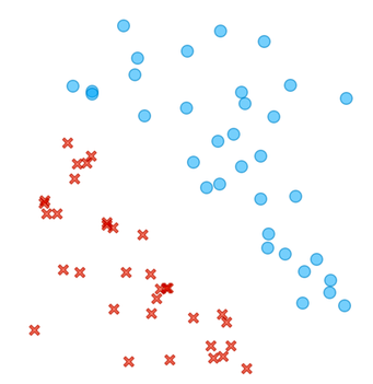
Can you draw a line between circles and crosses? How about finding a dividing line in this more complicated case?
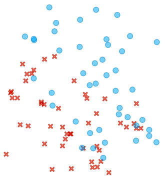
There is no clear cut here, but most of the circles are in the upper right and the crosses are in the lower left part of the plane.
We will learn that machine learning is really about finding that dividing line, the best one possible given the data. While sometimes, as in our first figure above, the line will perfectly divide the area of the crosses and circles, in real life, the circles and crosses would most often overlap, and the line would leave some circles on the side of the crosses and vice versa. The machine learning method that draws such a line is called logistic regression, and it is the key element of neural networks and all the deep learning techniques we use today for generative models.
Let's start at the beginning and go back to crosses and circles. After revisiting this topic, with some quizzes :), we will look at some bicycle data, reuse classification trees (that we already know), and find out where they can fail. Finally, we will venture into predictive models and classification accuracy. Sound like a plan for the next few hours? Let's do it.
In this self-paced material, you will also find a few questions here and there. These are designed to get you thinking about the topics, and if you get them wrong on the first try, that's okay. The number of attempts to answer each question is unlimited to encourage you to try to find an answer for yourself. Afterwards (or when you give up), read the explanation, as it usually contains more than just the answer.
The material in these notes is offered under Create Commons CC BY-NC-ND licence.
Chapter 1: Decision Boundary
Back to circles and crosses. And the line that separates them. Consider a few such lines for the same circles-crosses data below.
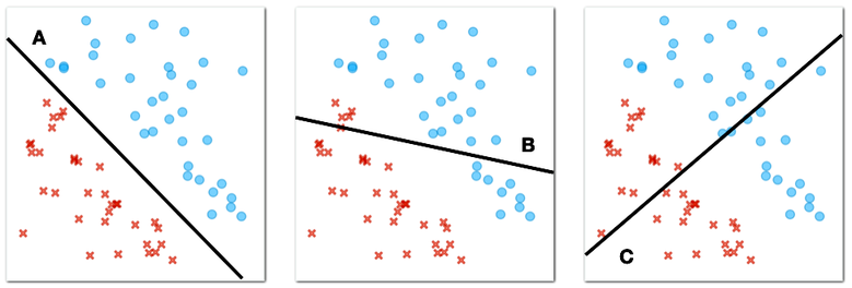
What line best separates circles and crosses? (1pt.)
The circles and crosses from our figure above are "linearly separable". "Linear" because we can use the straight line to separate them, and "separable" because our separator perfectly splits our two classes, the circles and the crosses, so that on one side of the plane there are only circles and on the other side of the plane there are only crosses.
Now consider another case where the circles and crosses are positioned as shown in the figure below.
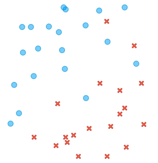
Here, there is no line that would perfectly divide the plane so that we would find all the circles on one side of the line and all the crosses on the other side. However, among many dividing lines, there are some that are better and some that are worse. Consider the following three lines.
Lines like these are called decision boundaries in machine learning. "Boundaries" because they define the area between circles and crosses, or as we call them in machine learning, two different classes of objects, and "decision" because we can use them to classify new objects.

Which line best separates the circles and crosses in the figure above? (1pt.)
Lines define a decision boundary, and we can use them to classify new objects. For example, the one we marked with a hollow square in the figure below. We only know the position of this object, and now we have to decide whether it is a circle or a cross.
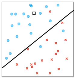
According to our decision boundary, i.e., a line we have drawn that separates circles from crosses, which class does a new object, marked with a square in the figure above, belong to? (1pt.)
Now consider four new objects for which we need to determine the class. We know their positions, represented by squares, and we also know that each of these objects should be either a cross or a circle.
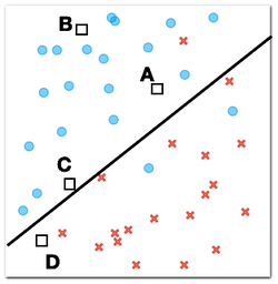
Which of the four new objects is most likely to be a circle? (1pt.)
Why? (1pt.)
There is a type of machine learning that finds a decision boundary in the form of a line when the data lies in a plane like our crosses and circles above. This algorithm is called logistic regression. Interestingly, logistic regression not only sets the decision boundary, but also assigns probabilities so that the probabilities of one class or the other are greater for the objects that are farther from the decision boundary, that is, farther from the line.
Now it is time to see logistic regression at work on some real data.
Chapter 2: Logistic regression
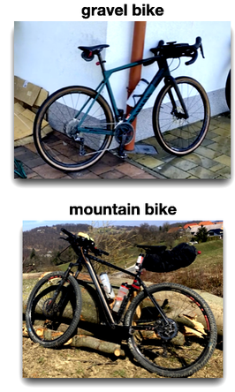
One of our colleagues, let us call him Janez for simplicity's sake, likes to ride his bike. He has two bikes, a gravel bike and a mountain bike. Gravel bikes are good for riding on both paved roads and rough gravel roads. Mountain bikes are more for, well, riding in the mountains. Like all serious cyclists, Janez uses Strava, an application that tracks rides and records various parameters, such as distance traveled and time spent on the bike, also called moving time. Along with these parameters, Janez also recorded which of the two bikes he was riding.
Our goal here is to build a predictive model that, given the planned route and the estimated distance and time spent for the trip, can suggest to Janez which of the two bikes he should take.
We start with the data. Janez has recorded all of his trips in 2023, and the data from these trips, including the distance and time spent for the trip, is available through the Orange Datasets widget. Using this widget, filter the datasets so that the widget shows only those with the word "bike" in the title, and select the dataset with the title "Gravel vs: Distance and Time". Then look at the data in the Data Table widget.
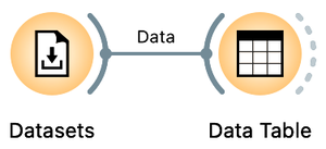
You can find the Datasets widget by right-clicking on the Orange canvas, typing "data" in the search box, and then clicking the line with the widget's name. Double-click the widget icon to open it. In the filter box, type "bike" and double-click the line that says "Gravel vs. Mountain Bike Rides: Distance and Time". Close the widget, draw the connection from the right antenna of the Datasets widget, and add a Data Table widget.
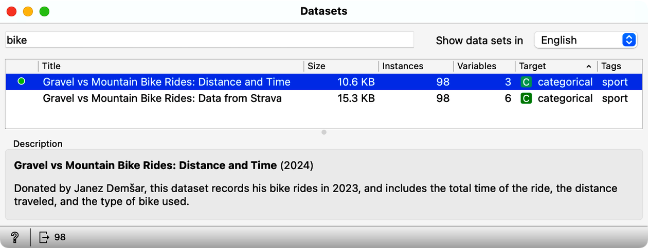
How many rides does this data set include? (1pt.)
Other than a class label, gravel or mountain, our bike riding data set contains only two variables, travel time and distance traveled. It is convenient to display this data in a scatterplot, a graph that can visually show the relationship between these two variables. Each point on the scatterplot represents a single bike ride, with one axis (for example, the x-axis) showing the travel time and the other axis (the y-axis) showing the distance traveled. To view this graph, add the Scatterplot widget to the output of the datasets. Your workflow should now look like this:
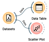
Looks like when spending the same time on the road, Janez travels faster on the gravel bike (check out the scatter plot). We wonder why that is?
Open the Scatter Plot widget. As expected, travel time increases with distance. But we are here to find out if these two parameters tell us which bike was preferred for a particular combination. For example, when Janez spent 3 hours on the bike, he used a mountain bike when the distance was about 30 km and a gravel bike when the distance was about 60 km.
Look at the scatterplot from our data set. Can you draw a line that separates gravel rides from mountain bike rides? (1pt.)
Janez is planning his next ride. The ride is 60 km and his trip planning app tells him it will take 5 hours. Which bike should he take? (1pt.)
Janez has had enough of mountain biking. The previous ride from our last question, or should we say, from our decision support task, was just too hard and he spent 5 hours sweating uphill. Now he wants to do some gravel riding and he has three different rides in mind:
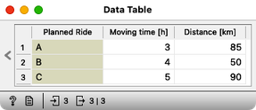
Which of these three rides is best suited for gravel bike? (1pt.)
This last question was probably a bit boring, as you had to carefully project the three points onto the scatterplot and somehow estimate the probability that Janez took the gravel bike, given the distance and travel time. Why work with Orange if we have to do all the guessing manually? And you are right. Time to do some machine learning and prediction in Orange.
Here is our plan: we will use our current travel data to build a predictive model for Janez's bike. We will use logistic regression. We will also load separate data for the three candidate trips into Orange. Finally, we will use the Predictions widget to which we will send both the built model and the new data set. Here is the workflow we will use:
We already have a Datasets widget on our canvas. Draw a line from its antenna to add the Logistic Regression widget. Draw another line from the output of the Logistic Regression to add the Predictions widget. Then download a file few-more-rides.xlsx and load it using a file widget. You can either add a File widget, open it, press the "..." button and locate the downloaded file, or just drag the icon of the file from where you downloaded it to the Orange's canvas; this will automatically place a File widget with the loaded data. Now add a Data Table widget to check if the data was loaded correctly, and also connect the File widget to the Predictions.
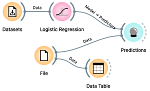
When loading a new dataset, the first thing to do is to verify that the data has been loaded correctly and to check out the data. First, the File widget should report what features the data contains: this should include travel time and distance. Then the Data Table widget displays the data and everything looks fine.
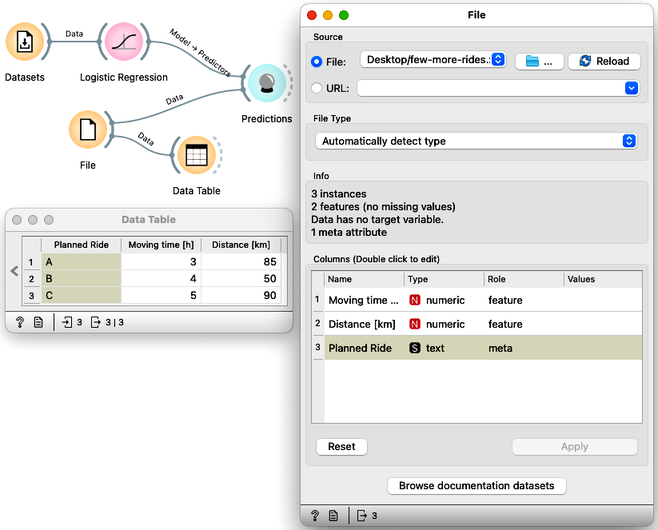
Now we are ready to see machine learning in action. Open the Predictions widget and see what the logistic regression tells us.
In this order, what are the recommended bikes for planned routes A, B, and C? (1pt.)
In addition to classes, Logistic Regression can also assign probabilities to its recommendations. In the Logistic Regression widget, change "Show probabilities for" from "None" to "Classes known to the model".
For which of the three candidate trips is the logistic model most undecided? (1pt.)
What is the probability that trip B requires a mountain bike? (1pt.)
Chapter 3: Accuracy
Above, we used logistic regression to build a model from a data set of bicycle trips and apply it to predict the types of bicycles needed for new, candidate trips. We often refer to the data from which we build a model as the training data set. Logistic regression worked well and helped us decide both the type of bike and the probabilities that this type of bike is the one Janez really needs for this type of trip.
We can build such models on any data set, but the question is how accurate these models are. Here we will learn how to evaluate such accuracy. We will start with our training set, develop a logistic regression model on it, and find out in how many cases from the training set the logistic regression got it wrong. We call such an estimate training set accuracy. Using the same bicycle data set from our previous chapter, we will develop the following procedure:
We already have the Datasets widget, properly loaded with our ride data, and Logistic Regression and Predictions. From your previous workflow, remove all other widgets and instead of the candidate bike rides, send our training data to Predictions.
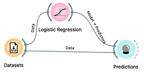
The Predictions widget now shows the predictions for all of our 98 rides from the training data set. It also reports the classification accuracy of the resulting predictions, shown in the CA column of the performance scores section. The classification accuracy of logistic regression on the training set is about 78%, which means that out of 98 trips, the logistic regression predictions were correct 98 x 0.78 = 76 times.
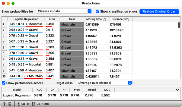
Not bad. But where are the mistakes? There's another widget to check where all the misclassifications went, and it's called the Confusion Matrix. Connect it to the output of Predictions, and check it out (double-click on the Confusion Matrix icon) to answer the next two questions.
You know the drill: drag the line from the Predictions widget, release the mouse, and then start typing "confusion" to get the Confusion Matrix widget on top. Press Return to add it to the canvas.
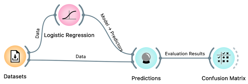
How many gravel rides where correctly classified? (1pt.)
How many mountain bikes rides were incorrectly classified as gravel bike rides? (1pt.)
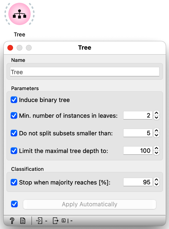
Besides logistic regression, you already know another learning algorithm: classification trees. The tree (the widget and its default setting; don't change anything for now) is great because we can analyze and interpret it, and sometimes it achieves high predictive accuracy. Sometimes. But not always. It is time to compare them to logistic regression. Try it yourself. Here are a few tips: just like logistic regression, the tree takes the data and can output a model. And that model can be fed into Predictions to assess classification accuracy. In essence, you already have the whole workflow, only the tree is missing.
How does the classification accuracy of the tree compare to that of logistic regression? Tip: classification accuracy (CA) is reported in the Predictions widget. (1pt.)
Hmm. Interesting. Because logistic regression has this linear decision boundary, we might think it is just right for our bicycling data set. Maybe we should look at what the tree looks like. We can use the Tree Viewer widget to visualize it and maybe decide if it tells us something about the problem (hint: do not expect much). To do this, we simply add the Tree Viewer widget to our workflow:
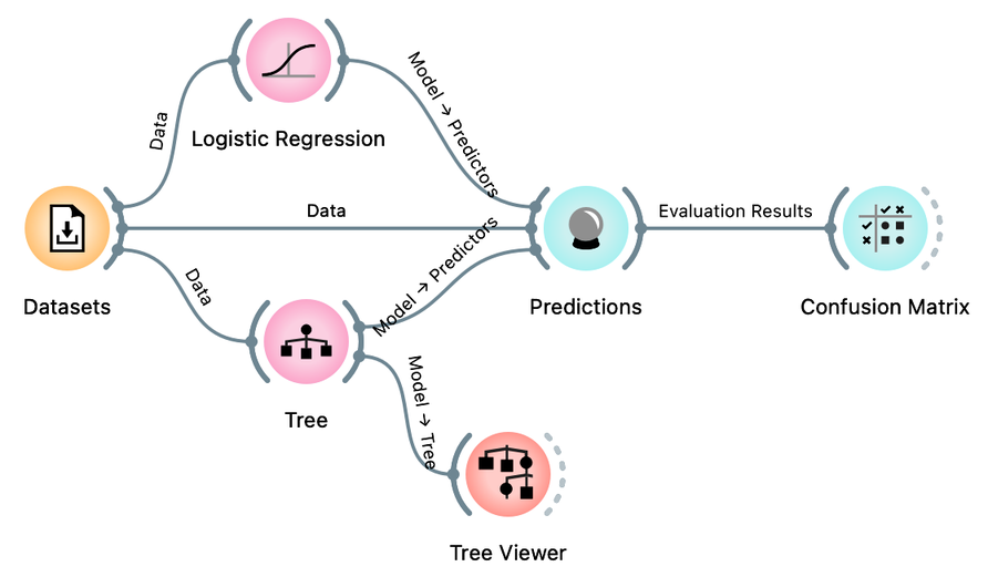
How many nodes does our classification tree have? (1pt.)
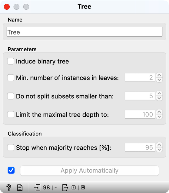
The tree learning algorithm has several parameters that limit the size of the tree. With the default training parameters, our tree was somehow manageable, although it was too large to fit into a reasonably sized computer window. Let us change these parameters by turning off all tree pruning methods.
How many nodes does the classification tree have after switching off all the tree prunning approaches? (1pt.)
Compared to the pruned tree, did the classification accuracy of the tree with pruning turned off increase or decrease? After turning off tree pruning, the accuracy... (1pt.)
We could close now, forget about logistic regression, and just use the trees. But something smells fishy. On our training data, the unpruned, fully grown tree model is very large. In fact, its leaves contain very few, often only one data instance. It is as if the tree cuts the space of our two features into very small regions containing only one of the bike types. In fact, the model is so complex that it remembers the bike type for all bike rides. No wonder it can then correctly classify all the bikes in the training set. Trees can build complex models that remember data instances well, and will outperform simple logistic models on the training set most of the time.
Did we say "on the training set"? Hm, what would happen if we estimated the accuracy differently? So we would test the models on the data set that was not seen during training. Here is our plan: let us split our data in half, use the first half of the data for training, and the remaining half for testing.
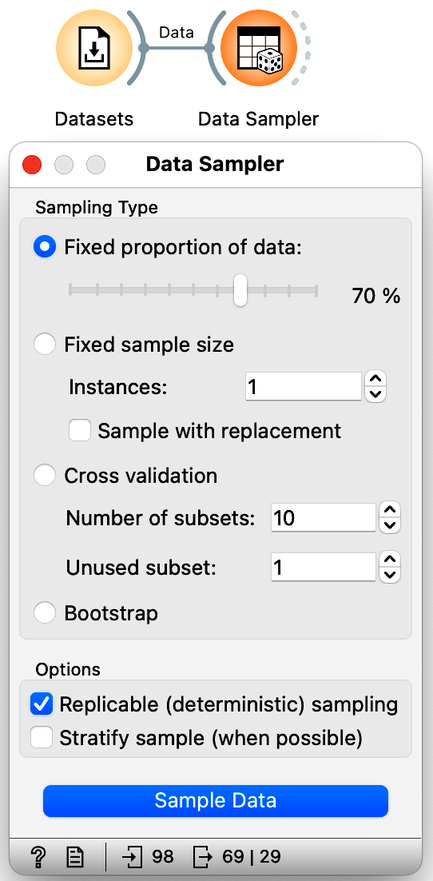
We will use the Sampler Data widget to split the data into training and test sets. We will leave the setting of this widget as it is, with 70% of the data going into a sample (for our training) and the remaining 30% of the data going into the test. Our workflow should look like this:
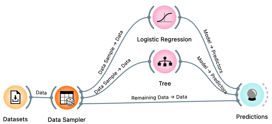
There is a trick here. When you connect the Data Sampler to the Predictions widget, Orange automatically connects the Data Sampler output to the Predictions. In Orange, widgets can have multiple outputs. Data Sampler can output the data sample or the remaining data instances that are not in the sample. To do this, we need to rewire the initial connection between the Data Sampler and the Prediction widget. Double-click on the line connecting the two widgets and rewire the connection as shown below:
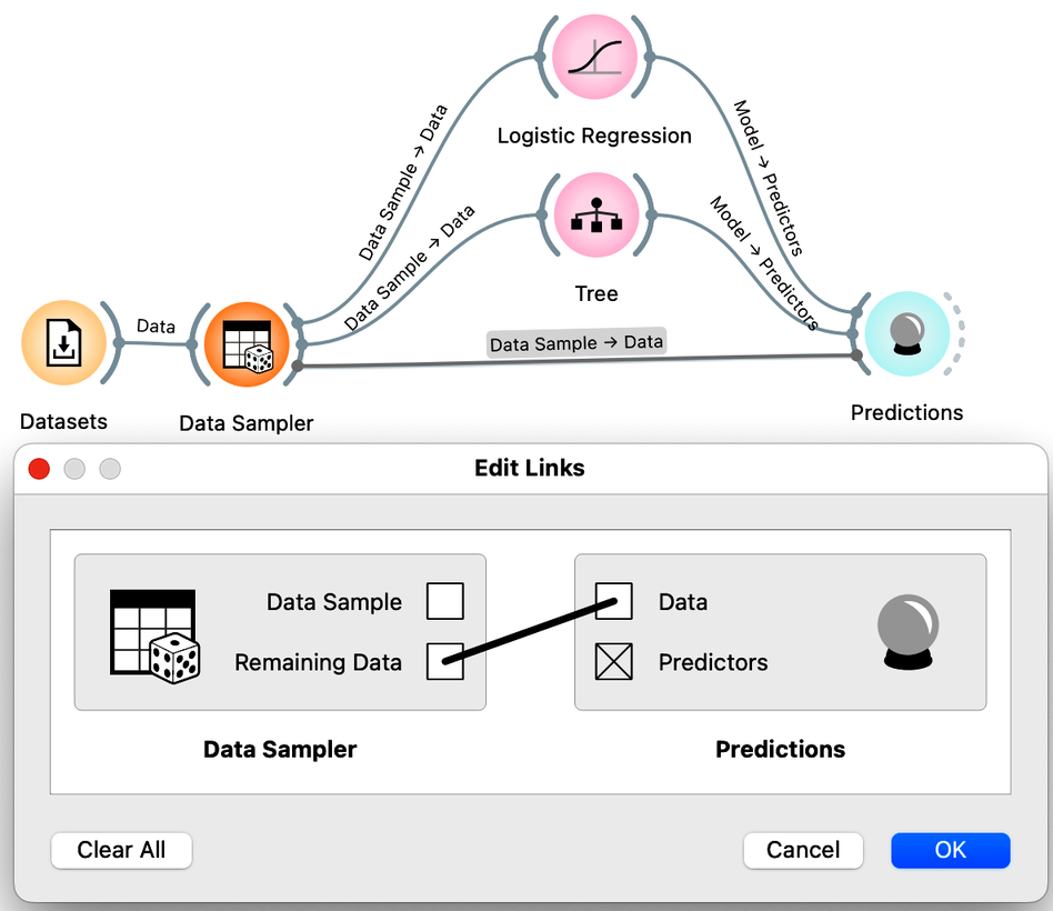
We are now ready to compare logistic regression and trees based on the accuracy estimated from the test data sets. How do more complex models, such as trees and unpruned trees, compare to the simple linear decision boundary of logistic regression?
Compared to the prunned tree (the tree with default parameters, all prunning methods on), the test set accuracy of logistic regression is... (1pt.)
Compared to the prunned tree (the tree with default parameters, all prunning methods on), the test set accuracy of unprunned tree is... (1pt.)
It seems that simpler models, such as logistic regression, may perform better than more complex models, such as fully grown trees. Complex models can overfit the training data, and do not generalize well when presented with the data instances they did not see during training. Performance on unseen data is what counts in machine learning, and we should always estimate accuracy on data sets that were not used in training.
Since we are pushing this idea of accuracy, one more thing. Open the Data Sampler, uncheck "Replicable (deterministic) sampling" and press Sample Data. Open the Predictions widget. Press Sample Data again. Each time you press Sample Data, a new data sample is generated, i.e., the widget sends out a different training and test data set.
Use our workflow to estimate the classification accuracy of logistic regression on different samples of training and test data (by clicking Sample Data in the Data Sampler widget as described above). The estimated classification accuracy (CA)... (1pt.)
We use the term learner here. Learner is an algorithm that can receive a data set and develop a classification model. The classification model is therefore a product of the learner when applied to a given training data. The Test and Score widget accepts a learner (and not a model) as its input, because within this widget the data is split into training and test sets several times, each time applying a learner to the training set and testing in on the remaining test set.
Turns out the accuracy on the test set depends on the test set :). This is not surprising. But if we want to report back to Janez what is the expected accuracy of the logistic regression model on his cycling data, which accuracy should we report? The highest or the lowest obtained by repeated sampling? Neither would be good. Instead, we can report the accuracy averaged over multiple samples. It would be tedious to calculate these averages by hand. Instead, Orange offers a Test and Score widget that takes the data, the learning methods (e.g., the tree or logistic regression learner), and repeats the data sampling, training, and testing procedure several times, reporting the averaged classification accuracy.
The workflow we will use to estimate the accuracy of logistic regression and compare it to the accuracy of the tree is shown below:
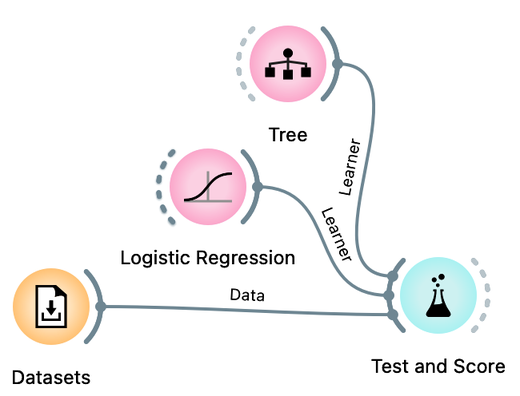
Compare the estimated accuracy of logistic regression and the tree learner. Experiment with different prunning parameters of the tree. (1pt.)
Great. This confirms our intuition from the scatterplot visualization that logistic regression, a simpler model, will work well on our data set.
One last note before we close this chapter: Test and Score includes various means of splitting the data. In machine learning, the most popular is called k-fold cross-validation, where the data is divided into k roughly equal groups. In each iteration, one of the groups is considered the test set, and all other groups form the training set. The results are averaged over k such trials, each time considering a different test set. This is slightly different from random sampling, where data instances may appear in test sets many times, or perhaps never. Cross-validation ensures that each data instance appears in exactly one of the test sets.
Chapter 4: Multidimensional Data
Janez's Strava record actually contains data variables other than just distance and time. Check out the "Gravel vs: Data from Strava" datasets available in the dataset widget:
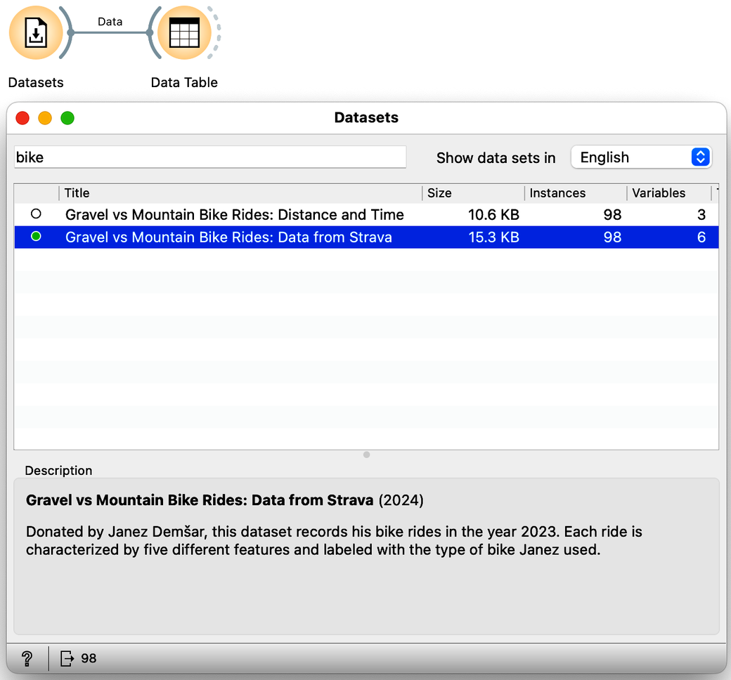
How many independent real variables does this data set contain? Ignore the bike classification variable, which is a dependent variable. (1pt.)
In the previous chapter, the data contained only two independent variables. We could plot the data on a scatterplot and find a line - a linear model - that separated the two types of bicycles that Janez takes on his trips. Now the data lives in five dimensions, and instead of the line, the decision boundary is now a hyperplane. This is still a linear model, actually a weighted sum of our features, and we can still use logistic regression for our classification. Except we can no longer see the decision boundary. But ok, at least we know how to estimate the classification accuracy:
What is the estimated accuracy of logistic regression on the Janez's Strava data set? Use five-fold cross validation for estimation in the Test and Score widget. Report on accuracy in percents, rounded to an integer (say, 67, if the accuracy reported by the widget is 0.668). (1pt.)
We can now experiment with different sets of features; that is, we can include some of the five features from the data set and see how the model performs with the remaining set of variables in the data. We will use Select Columns for this task. For example, we can tell it to build a model using only information about altitude and number of photos taken:
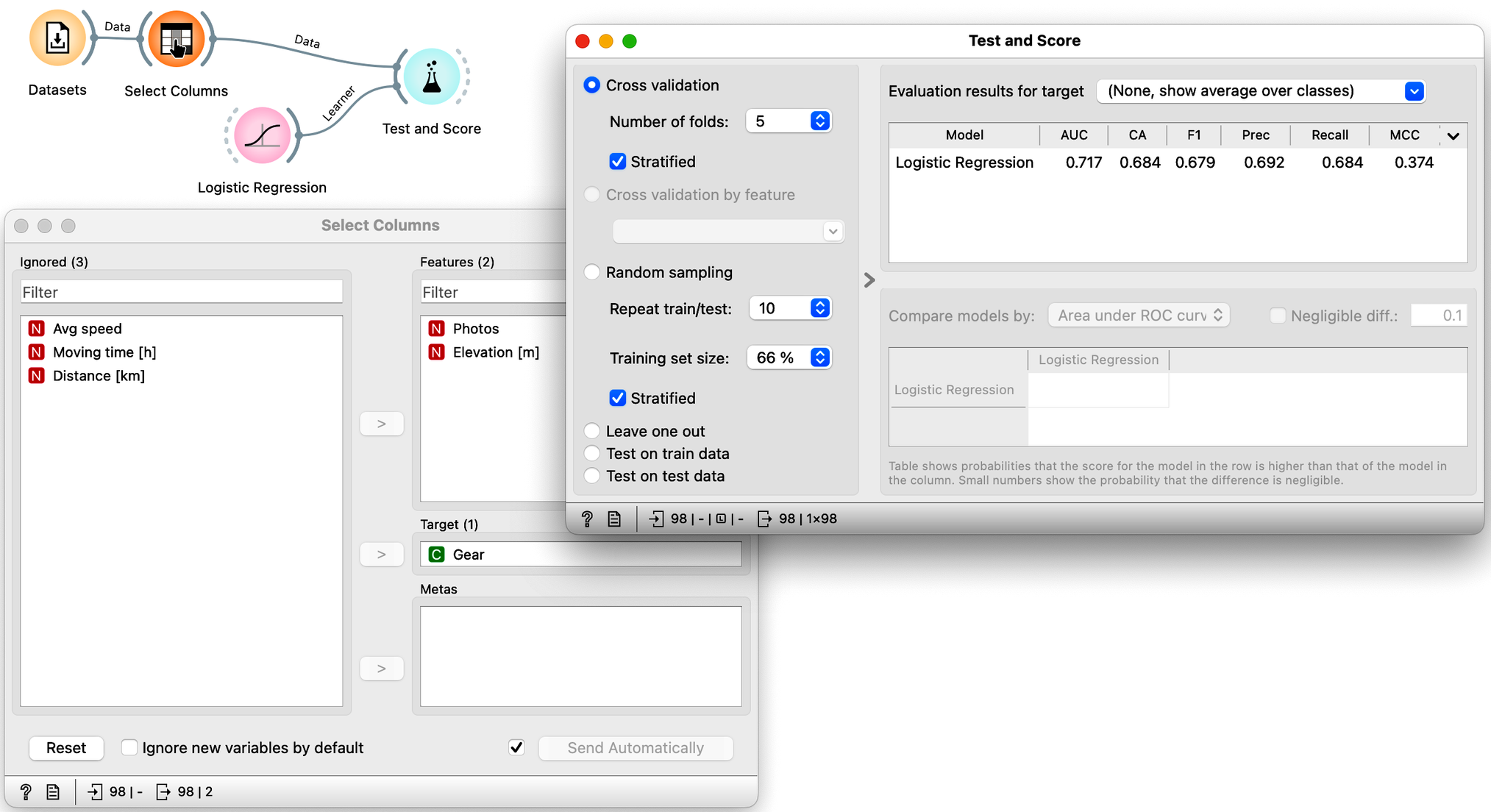
Note that using just these two features, the cross-validated classification accuracy drops to 68%.
Which of the following feature sets is the most informative, i.e., gives the best cross-validated accuracy? (1pt.)
One last note here. There is a nice visualization of the logistic regression model called a nomogram. It is possible to visualize logistic regression because its probabilities depend only on the distance from the classification boundary. And since the boundary is linear, the distance is actually expressed as a weighted sum of the features. The only remaining question is how logistic regression transforms this distance into probabilities, and in order not to make this chapter too long, let us just say that this is done by a logistic function. Hence the name: logistic regression. Oh, here is the nomogram:

Nomogram can convert any choice of feature values into class probabilities. This one calculates the probability that Janez will take a gravel bike on his trip. We can see that distance, travel time and average speed are the three most important features for the prediction.
What is the probability that Janez will take mountain bike on a 70 km four-hour ride, where he will push for an average speed of 15 km/h for elevation of about a 1000 m. He promises to take 10 photos. (1pt.)
Nomograms are great tools. In medicine, a combination of logistic regression and a nomogram is still the most commonly used predictive model of all, despite the emergence of other AI-based techniques. Not that the latter are all that different from logistic regression. As we will learn next, today's AI is just a combination of many logistic regressions assembled into one big neural network. The problems we observed here, including overfitting, parameter estimation, feature selection and prioritization, and accuracy estimation, are no different and remain. At least we now understand them intuitively.