Data Mining @ BCM
Part 3: Dimensionality Reduction
This textbook is a part of the accompanying material for the Baylor College of Medicine's Data Mining course with a gentle introduction to exploratory data analysis, machine learning, and visual data analytics. Throughout the training, you will learn to accomplish various data mining tasks through visual programming and use Orange, our tool of choice for this course.
These course notes were prepared by Blaž Zupan and Janez Demšar. Special thank to Ajda Pretnar Žagar for help in the earlier version of the material. Thanks to Gad Shaulsky for organizing the course. We would like to acknowledge all the help from the members of the Bioinformatics Lab at University of Ljubljana, Slovenia.
The material is offered under Create Commons CC BY-NC-ND licence.

Concepts Covered
In this chapter, we will cover the following concepts in classification and model evaluation:
-
Principal Component Analysis (PCA) – A projection-based dimensionality reduction technique that finds new axes (principal components) capturing the most variance in the data. It applies a mathematical transformation to project data onto a lower-dimensional space without altering distances between points.
-
Explained Variance and Scree Plot – PCA identifies how much of the total variance each principal component explains. The scree plot shows the proportion of variance retained by each component and helps determine the number of components to keep.
-
Feature Weights in PCA – Each principal component is a linear combination of original features, with weights indicating their importance. Features with large absolute weights contribute more to a given component, revealing the structure of the data.
-
Multi-Dimensional Scaling (MDS) – An embedding technique that optimizes the placement of points in a lower-dimensional space while minimizing the difference between original and embedded distances. It iteratively adjusts the point layout to best approximate pairwise distances.
-
PCA vs MDS – While PCA computes a mathematical projection, MDS optimizes point locations to maintain distances as faithfully as possible. PCA works well for identifying major variance directions, whereas MDS is more suited for visualizing distance-based relationships.
-
t-Distributed Stochastic Neighbor Embedding (t-SNE) – A non-linear embedding method that prioritizes preserving local neighborhoods rather than global structure. It minimizes a cost function that encourages similar points to stay close while allowing distant points to spread apart.
-
Embedding – A general approach where a cost function is optimized to arrange data points in a lower-dimensional space. Unlike projection, which follows a direct mathematical transformation, embedding methods (e.g., MDS, t-SNE) iteratively adjust positions to best satisfy the given optimization criteria.
-
Dimensionality Reduction for Clustering – Techniques like PCA, MDS, and t-SNE help in clustering by reducing noise and making patterns more visible. t-SNE enhances local structure, MDS preserves global distances, and PCA provides a variance-based projection that can reveal feature importance.
Chapter 1: PCA
Let’s take a moment to think about the stars. A typical image of the night sky, as shown by Google, might look like the one below. See the bright band stretching across the sky? That’s our galaxy, the Milky Way—or more precisely, a two-dimensional projection of our galaxy as seen from Earth.

That's an unusual way to think about stars. However, based on the appearance of the night sky, one might model our galaxy as a line, suggesting that most of the Milky Way's stars are positioned side by side along a straight path. But we know this isn't the case. Astronomers have measured the distances of stars in our galaxy and determined that it actually has a spiral structure, as shown below.

This image is also a two-dimensional projection of the stars in our three-dimensional galaxy. So, which model of our galaxy is better—a line or a spiral? Which provides more insight into the structure of the Milky Way? And if we focus on a specific star, which model gives us a clearer understanding of its location relative to other stars? Clearly, the more informative projection is the spiral.
In data science, we also rely on visual representations of data. Imagine each data instance as a star, but positioned in a multi-dimensional space. Just as we visualize the Milky Way as a spiral to better understand its structure, we seek a two-dimensional projection of data that preserves as much information as possible. A popular technique for achieving this is called principal component analysis (PCA).
Let’s apply PCA to an example dataset. We will use the Zoo dataset from the Datasets widget. This dataset describes animals such as bears, boars, and catfish, with features indicating characteristics like having hair, feathers, laying eggs, or giving milk. Additionally, the dataset includes information about the type of animal.
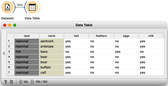
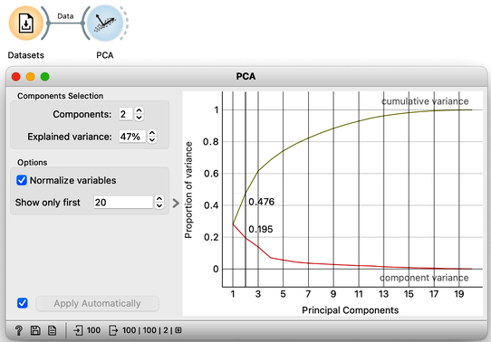
We can send this data into the PCA widget. PCA identifies the axes—principal components—in a multi-dimensional space where the data varies the most. For our Zoo dataset, PCA reveals that the first principal component explains 28% of the variance, while the second component accounts for 19%, meaning together they capture nearly half of the total variance in the data. For now, we focus on two-dimensional plots and consider only the first two principal components.
Notice that PCA considers only the data features, meaning it ignores information from other types of variables, such as the class and any meta-features.
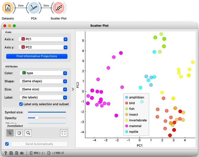
One of the outputs of the PCA widget is our dataset with two additional columns: PC1 and PC2. These define the position of each data instance—each animal—in the PCA projection. We can use these two coordinates in a scatter plot, setting PC1 as the x-axis and PC2 as the y-axis. Additionally, we can color the points according to the type of animal. As expected, mammals cluster closely together, as do fish and reptiles. However, insects appear somewhat intermixed with birds.
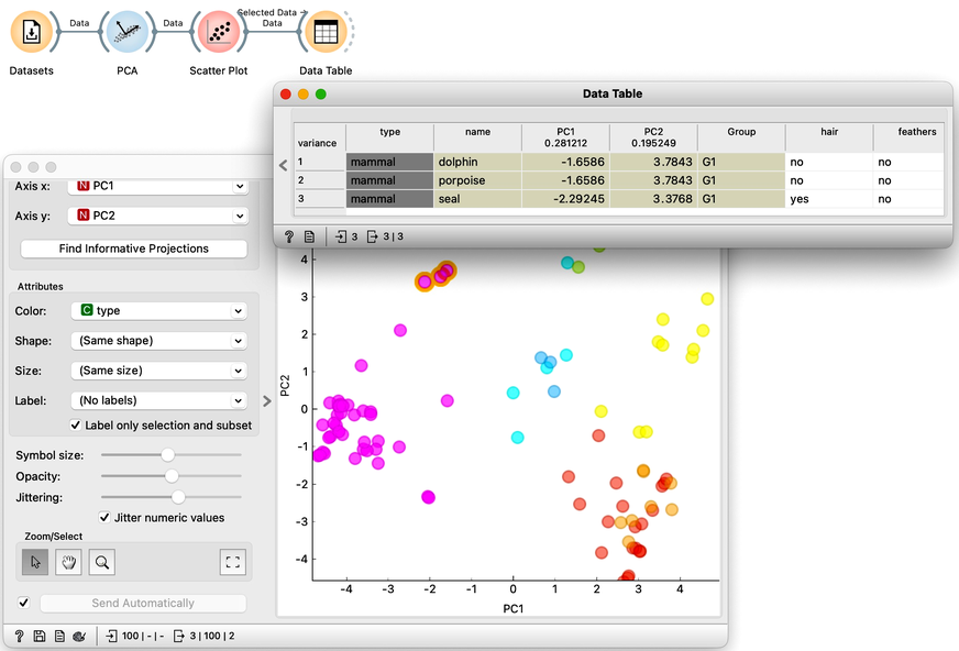
Let’s select the mammals that are closest to the fish and examine them in the Data Table. Unsurprisingly, we find the dolphin, porpoise, and seal. Dolphins and porpoises share identical feature values, meaning they are projected to the same coordinates in the PCA plane. We can reveal this overlap by jittering the points slightly.
Chapter 2: PCA details
The introduction to principal component analysis (PCA) in the previous chapter was intentionally brief. Our goal was to jump straight into using PCA on a dataset and experience the benefits of visualizing multi-dimensional data by reducing it to two dimensions. And we did just that—we explored a dataset with sixteen features describing one hundred animals.
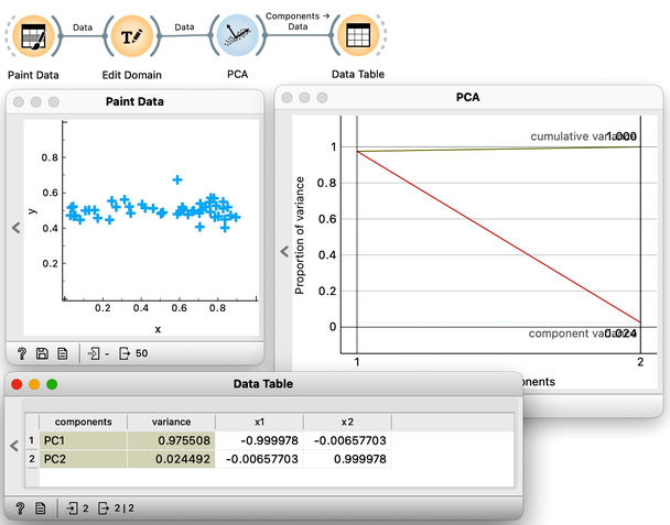
Now it is time to slow down a bit and delve further into some of the details of this exciting dimensionality reduction. We will use Orange’s Paint Data to create a two-dimensional data set and try to make it as linear as possible. This way, to determine the position of each data point, it is sufficient to know its projection onto this line. These distances, from the center of all the points to the individual projections, represent the values of the first PCA component. We can now use these distances—that is, these components—to represent our data with a single number. The prevalence of the first component in our data is also evident in a scree plot of the PCA widget: the values of the first PCA component contain 98% of the information about this data. Everything else that remains is a projection onto the second PCA component, which is orthogonal to the first one. The projections onto the second principal component clutter together, and the differences between the projection values are small.
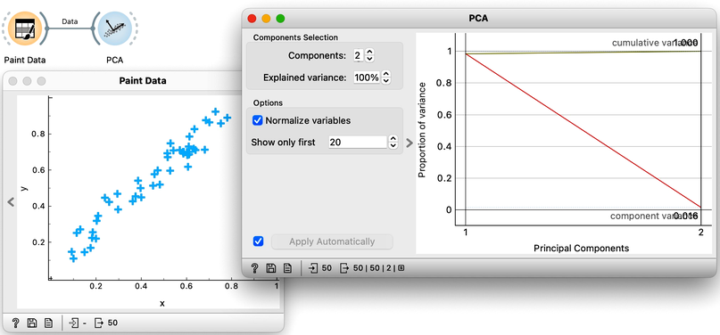
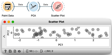
Notice also that the scree plot reports only two components. They are sufficient to describe all our two-featured data faithfully, as nothing else remains. For more complex data with a higher number of features, the scree plot would report a higher number of components. We can observe the data in the projection space. Let’s use a scatter plot and set the axes to PC1 and PC2. It looks messy, but notice the scale: PC1 spans from -2 to 2, while PC2 has a much smaller range. We can squeeze this graph to scale it properly. PC1 is the major axis, and the data spans its entire dimension.
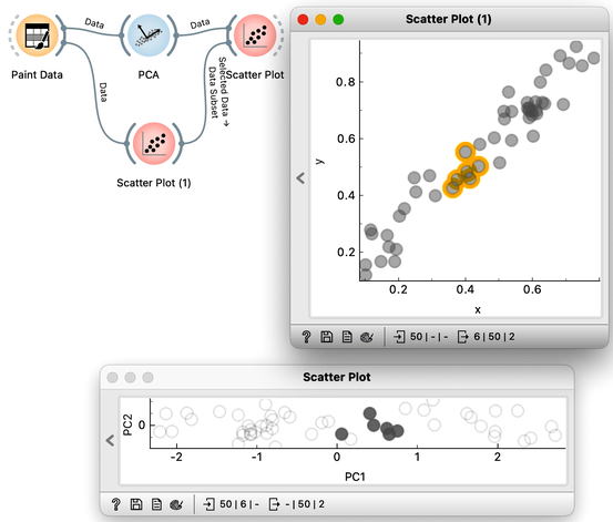
We can also check the location of the original data in the projected space. First, we will plot the original data in the scatter plot, select a few data points—say, in the upper corner of the plot—and send that subset to our plot showing the projected space. Here they are, exactly where they should be. And here are my data points from the bottom and the center.
What would happen if we added a few more data points? This time, we might place them slightly to the side—like this:
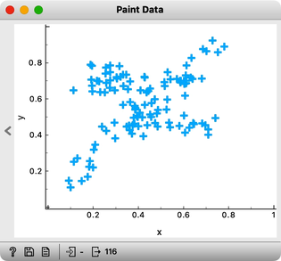
Observe the change in the scree plot. The first component now explains only a portion of the variance and is nowhere near 100%. If we add more offset data, this effect becomes even more pronounced.
If our data were evenly distributed across the entire data space, the explained variance of the first principal component would approach 50%. Thus, we would not be able to effectively reduce the number of dimensions to a single component. This, we hope, tells us something important about PCA: we can only successfully reduce the number of dimensions if the original features are correlated. In our two-dimensional space, this means that the data is aligned along a line. In the absence of any correlation, however, there are no opportunities for dimensionality reduction. In real data sets, features most often correlate to some degree, forming groups of correlated features. For such data sets, applying principal component analysis makes sense. It is then useful to explore the directions of principal components and the features they depend on the most.
Chapter 3: Explaining PCA
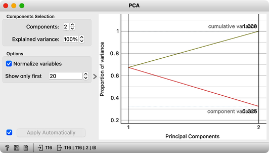
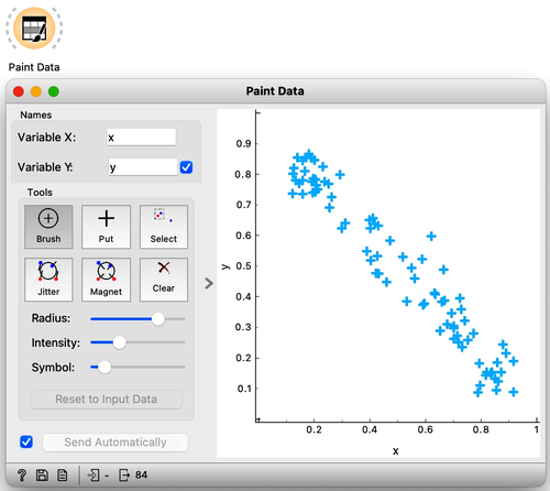
In the previous chapter, we used principal component analysis primarily to reduce and display our data in two dimensions. This time, we will take a closer look at the relationship between the data’s features and their principal components. Let’s start by painting some two-dimensional data, as shown in the following figure.
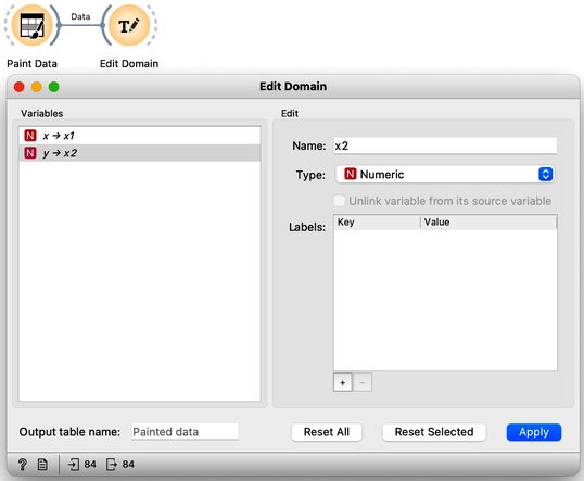
Next, just to use standard notation, I’ll rename the two features to and using Edit Domain widget. Also, don’t forget to press Apply for the changes to take effect.
Visualizing our data in Scatter Plot, notice that the first principal component should probably be along the downwards pointing line. And a line is just a set of points that satisfy a linear equation. In our case, I have two features, and , and the points on the line would need to satisfy the equation .
The s are the parameters of the equation that defines the line. A vector that defines my projection line should have a and of opposite signs, pointing either up and left or down and right. Coefficients and are also called components of the principal axis and report on the weight or influence each feature has on this principal component's values. Since I drew my data diagonally, I expect both features and to have more or less equal weights. Also, as a side note, the thetas of the line that defines the second component should have the same sign.
It is now time I check this in Orange and stop doing the analysis by hand. We use the PCA widget, and just for this demonstration, we will switch off the normalization.
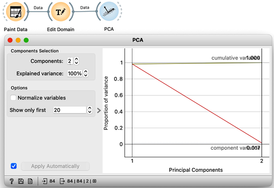
The scree diagram tells us that and are well correlated and that the first PCA component covers most of the variance. WE would like to double check if my predictions are correct, so we will take a quick look at the thetas, that is, the weights of the features for each component. For this, I will use a Data Table widget and rewire the link to pass information about PCA components instead of the modified data.
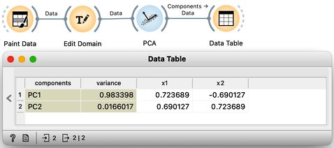
Each row contains information about each principal component, the variance it explains, and the feature weights [highlight accordingly]. Just like we expected: for the first PCA component, and are approximately equally important and have opposite signs. The signs of the weights for the second component are also, unsurprisingly, the same [highlight].
We can now change the data slightly, so it spans along a single axis. Again, the first component explains almost all the variance in this data. But looking at the weights [open Data Table], we can see that the first feature, , with the highest weight for PC1, is the one that defines the first component. The remaining variance spans along the axis.
This may have been a little abstract. But we learned that the weights of the principal component axis tell us which features are relevant to each component and to what degree. We can now use the zoo dataset from our previous chapters. Zoo data contains 100 animals described by features like having hair or fathers, or whether they lay eggs or produce milk. One thing to note though, is that all the features are categorical. This means that they are not numbers. For PCA, we need numbers. So, the PCA widget automatically transforms each categorical feature into a numerical one. We can do this explicitly, using the Continuize widget. Just leave the settings as default. We can use the Data Table to see what we get on the output.
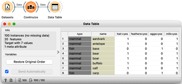
All categorical features have now been converted to numeric values. For example, the antelope has a 1 in the "hair=yes" column, indicating it has hair, while the bass, a fish, has a 0 in this column, meaning it does not.
Now, we can add PCA analysis to our workflow. While we could observe individual feature weights in a Data Table, this would present a collection of numbers without clear patterns. Instead, we first transpose the data on components with weights using the Transpose widget and rewire the connection. To organize features by the magnitude of their weights, we introduce the Feature Constructor widget. Since we are interested in the absolute magnitude of weights rather than their sign, we define "weight for PC1" as the absolute value of PC1 and similarly "weight for PC2" as the absolute value of PC2.
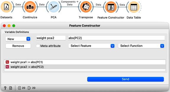
We can now rank the features by weights of the first principal component.
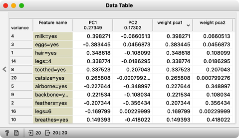
As it turns out, "Milk" is the feature that most defines this component [highlight the number in the weight PC1 column]. It is followed by "Eggs", but note that the PC1 value here is negative, meaning it actually represents the absence of egg-laying. The next most important feature is "Hair".
Accordingly, some animals give milk, do not lay eggs, and have hair. This component likely distinguishes mammals from all other animals.
The second component has large weights for aquatic animals, animals that breathe, and airborne animals. This component should effectively separate fish from birds.
Chapter 4: MDS
Here, we will discuss about the embedding of data into two-dimensional space. While this may sound complicated, we can assure you it is not. We will start with a simple example and work the idea to the point where I can embed the zoo data set from my previous videos into a 2D map.
For distances between, say, cities in U.S., please check another website. Or this one for the distances between Asian Cities.
We found a website that reports travel distances between some European cities. It says, for example, that Barcelona is about 1500 km from Belgrade, which in turn is another 300 km from Budapest.
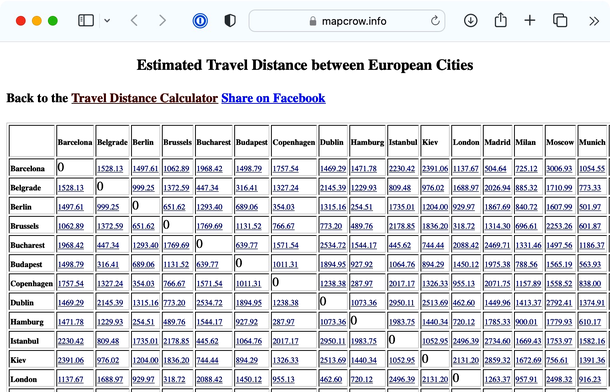
To do this in Orange, the first step is to prepare the data. We will copy the distances into Excel, using Edit-Paste as Special-Text to get rid of the formatting, and save the file to the desktop. And instead of the first row with labels, write that there are 24 cities and indicate that the matrix contains the row labels (highlight the first row, press delete – do not delete the row, and type “24” and “dist” in the first two empty cells). Orange, for now, uses its own legacy format for distance matrices, so until we fix this, you will have to follow these steps. We will store our data as a tab-delimited text. In Excel, use Save As, choose Tab Delimited Text], and save the data in a distances file. We also need to rename the file to change its extension to .dst. That is, save the file to desktop and rename it to use .dst extension.
To load the distance matrix into Orange I use the Distance File widget. It tells me that the data contains 24 labeled data instances which I can examine in a Distance Matrix.
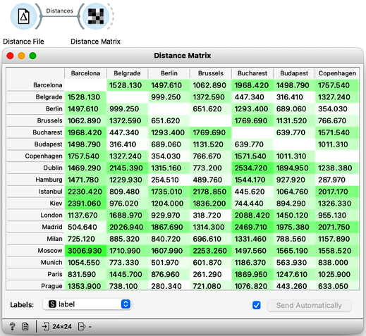
Good, it looks like the distances were read all-right. Now for the main trick. I will use an embedding technique called multi-dimensional scaling and turn the distances into a two-dimensional map of European cities. All I need to do is connect the MDS widget to the Distance File. There we go. I see Belgrade is indeed close to Budapest. And Prague is close to Vienna, Munich, and Berlin. Moscow is way off to one side with Barcelona and Madrid on the other.
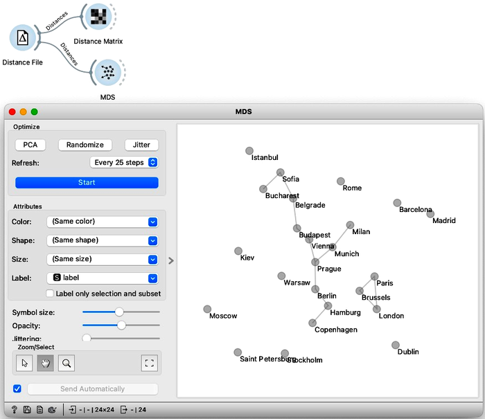
Multi-dimensional scaling seems to have recreated a map of European cities, except it’s flipped upside down. This geographic information was not in our original data; we provided only the distances. A map of European capitals, oriented as we are used to, would normally look more like this.
Madrid on the bottom left, Dublin to the north, and Moscow far right. We can help Orange by flipping the MDS coordinates. Note that MDS can also output the entire data set, with embedding – that is, inferred two-dimensional coordinates – stored as meta-features. Anyway we use the Feature Constructor to introduce two new variables, x and y, that flip the computed MDS coordinates. Please note that we need to rewire the connection between MDS and Feature Construction to pass through the entire dataset and not just selection. Now when we present our data in Scatter Plot, it places the cities the way we are used to on a map.
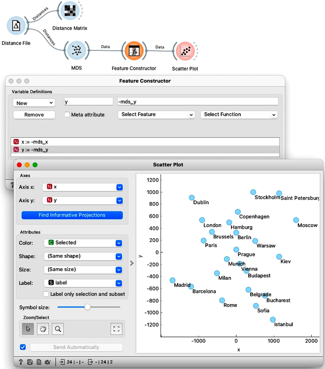
Take a second to appreciate what multi-dimensional scaling is doing here. We gave it the driving distances between pairs of cities and Orange used that data to place the cities in a way that closely resembles a proper map of Europe.
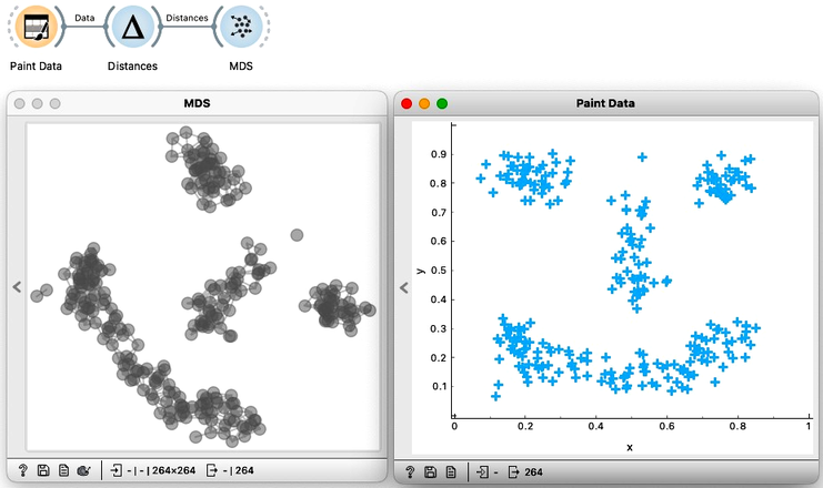
We can do this with any data as long as we can construct or obtain a distance matrix. Say, the zoo dataset. To do so, let us construct a new workflow. We load the zoo data set using the Dataset widget. Remember, the data contains information on 100 animals described by 16 features such as the number of legs or whether they have hair or feathers. Using this data we construct the distance matrix with the Distances widget. As we have already used this widget in every workflow for hierarchical clustering we will skip the details for now. We can examine the computed distances by feeding them to the Distance Matrix. And finding them intact we can continue by feeding the distances to MDS. Taking a look at the plot, it makes sense. The mammals are clumped together, and so are the fish and the birds. The three mammals that are closest to the fish are, no wonder, the dolphin, platypus, and porpoise.
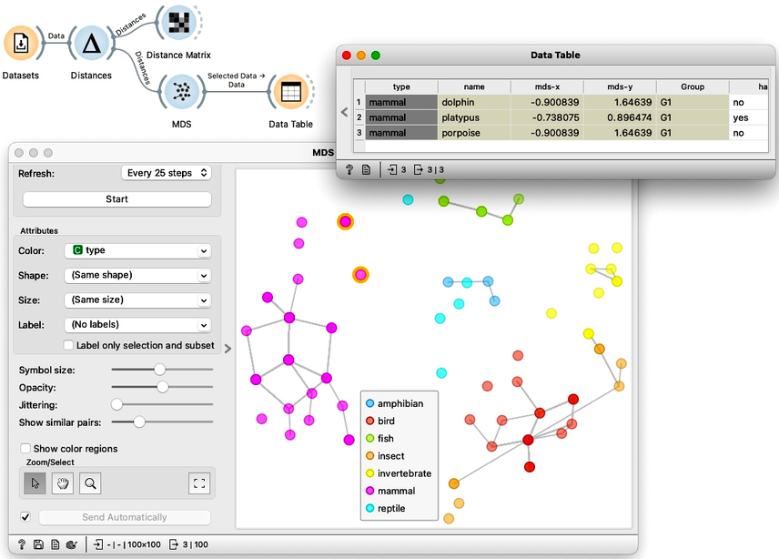
If we compare this plot to the principal component plot we have developed in the previous chapters we might also remember the insects and birds aren’t as intermixed this time. However, Orange still indicates with a line that some insects should be closer to some birds than depicted on the map.
Remember, we estimated the distances from a 16-dimensional space, and multi-dimension scaling can only approximate these distances in two dimensions. The distances in two dimensions will never be entirely faithful to those we estimate from 16-dimensional data. If they were, all that 16 dimensional data would lay on some two-dimensional plane, making 14 dimensions completely redundant. We can get the impression of "faithfulness" by changing the threshold of when Orange links two instances (use "Show similar pairs" slider in the MDS widget)
Multi-dimensional maps remind us of the plots we constructed with principal component analysis. Remarkably, these two entirely different algorithms can result in very similar visualizations. PCA finds the two-dimensional projection, which retains the most variance, while MDS aims to preserve all the pairwise distances. PCA is a projection-based approach, while MDS iteratively optimizes the placement of points. MDS embeds the data in two-dimensional space, where resulting coordinates have no meaning. The main advantage of multi-dimensional scaling is that it can handle distance matrices directly, while PCA requires tabular data representation.
Chapter 5: t-SNE
Multidimensional scaling aims to preserve all the distances from the original data space, meaning it tries to maintain both the distances between the neighboring data points and between the data points that are far away. In real life, we often only care about things that are close together. Anything far away is just far away, and the exact distances do not really matter. For example, the author of this text cares how close his home and workplace are, as traveling half an hour more, or less, makes a huge difference. But if he drove from his home in Ljubljana to Paris, thirty minutes would not really matter to him on a 14 hour trip. Paris is just far away.
Similarly in data visualization, anything close together should matter more. Do we worry about retaining each individual distance, or are we just interested in exposing data instances that are close to one another? For example, if we are looking for the clustering structure of some data, then all we really want is to clump together the data that is close enough.
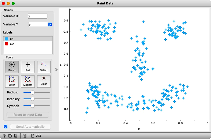
Consider the following painted data with a couple of obvious clusters.
Note that the MDS widget can be connected to the data source directly, without computing distances explicitly. The result in this situation is the same as using the Distance widget with Euclidean distance. And second, while t-SNE also requires the distances, the current implementation in Orange computes Euclidean distances directly from the data so it cannot actually receive distances on its input.
First we will use the Distances widget to compute the pairwise distances between the data instances. Then I use the MDS widget to take those distances and create a map. We will be using a two dimensional dataset so we can expect MDS to recreate it exactly. We will here just leave these two images here, side by side, so you can clearly see that they are indeed the same. If, somehow rotated.
Moving on we will here try out another visualization tool, the so-called t-distributed stochastic neighbor embedding, or t-SNE for short. t-SNE only cares about neighbors. In this visualization, the idea is that the points that were nearby in the original space will stay close together. So let’s give it a shot. We will connect our original data to the t-SNE widget. And see that the nearby points are still clumped together.
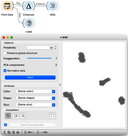
This ‘clumping’ in t-SNE is controlled by the exaggeration parameter, so take a look at what happens if I emphasize the locality even more by raising the exaggeration to 2.
We are now curious to see what t-SNE would do with the zoo data we have been using in our previous chapters. So, starting off with an empty canvas, we can load the zoo data from the Datasets widget, and connect it to t-SNE. We also see it colors the data by animal type. The are no overlaps; the mammals, the fish, the birds, and even the invertebrates are all in their own cluster.
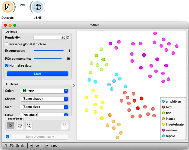
We can compare this embedding to what we got from MDS and PCA. Try it on your own. The difference is not staggering, but t-SNE did seem to do a better job clustering the same types together.
t-SNE and MDS seem similar in two dimensions, but the difference becomes more pronounced with larger data sets. We will discuss more about this in our next chapter, but for now, we just want to conclude by explaining what the name t-SNE or t-distributed stochastic neighbor embedding actually means. Well, it is an embedding, this means it places data points in a smaller space, in our case a two-dimensional one by optimizing their locality. And it does this by looking at each point’s neighbors. Also stochastic just means there’s an aspect of randomness. In this case it’s because we initialize it with random points. And finally, the comes from the -distribution which is used to determine the importance of each neighbor.
The main takeaway here is that MDS preserves the distances while t-SNE preserves each point’s neighbors.
Chapter 6: t-SNE vs PCA vs MDS
We have introduced three dimensional data reduction techniques: principal component analysis, multidimensional scaling, and t-distributed stochastic embedding. Our main objective was data visualization, that is, in reducing the number of dimensions to two. On smaller data sets, We have found these techniques to yield similar results. But this should come as a bit of a surprise, because the three approaches are very different in nature.
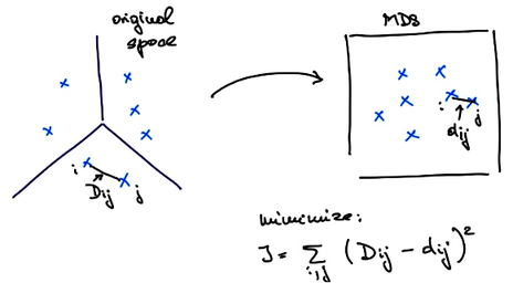
PCA is a projection. Meaning that for some data PCA finds its projections to the axes defined by principal components. These principal axes are computed directly from the data using the eigenvectors of the covariance matrix. And they can be used to place new data instances into a data space. On the other hand, MDS considers distances, that can come from some multidimensional data. Let me denote the distances between each pair of points and with . MDS aims to embed our data into a two-dimensional space in such a way that the resulting distances are as close to the original distances as possible. If I call the distances in the new, two-dimensional space also called the embedded space with , then what MDS tries to do is minimize .
MDS finds the embedding that minimizes this criteria function iteratively. It starts with a random placement of points and then, in each iteration, moves the points slightly to lower the value of the criteria function. We can take a look at how this happens on the zoo data set. In MDS widget we can randomize the positions of the data points, set Refresh to Every iteration, and press Start. Something to be aware of here is that the results of the optimization procedure MDS uses may depend on the random initialization. To make things more deterministic MDS usually starts with the placement of points obtained by PCA instead of a completely random placement.
On to our last algorithm, t-SNE. This is also an embedding that uses iterative optimization to find the best placement of points. It is similar in execution to MDS; they just use different criteria functions. t-SNE's criteria function is a bit more complex and prioritizes maintaining the distances between each point's neighbors.
The differences between the three methods can be huge. This time we will use another biological data set, called "Bone marrow mono-nuclear cells". Each of the 1000 rows contains data on a single bone marrow cell. Here, let us not go into much detail about this data set, it is enough to know that it contains 1000 features, that is genes, that record the activity of the genes in each cell. There are multiple types of bone marrow cells and we might expect to identify them by clustering the data. So, we will first pass this data to PCA and look at the result in a Scatter Plot. The coordinates, PC1, and PC2, are at the very end of the list of features.
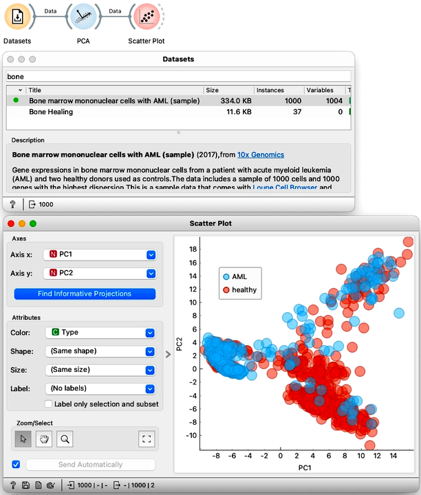
Let us compare the PCA visualization to what we get from t-SNE. This time the resulting visualization is really is completely different. The clustering structure is much more pronounced in the t-SNE visualization.
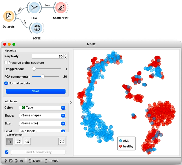
We could try to do the same thing again with MDS, but I find that it resembles PCA more than t-SNE, finding much less structure in the data.
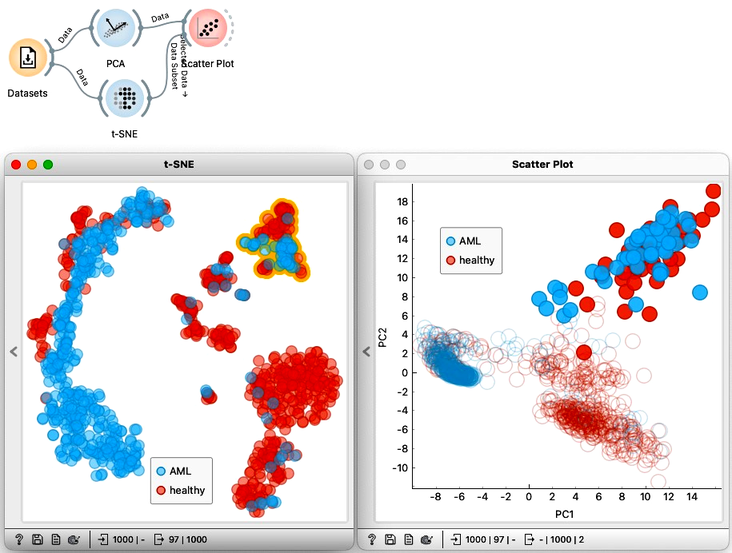
We can select a cluster from the t-SNE visualization and see where these points are in the PCA visualization. To do this, we can just pass the selection from t-SNE to the Scatter Plot widget. With both visualizations side by side, we can select any cluster in t-SNE to see how it translates to PCA. Notice that from PCA, we would only be able to find some of the clusters visible in t-SNE, but not all of them.
In summary: when we want to find clusters we would use t-SNE, when we care about ALL the distances, we would use MDS, and when we need some robust dimensionality reduction methods that use mathematical projection and retain as much variance as possible, we would use PCA.
Oh, more more thing. Just like clustering, any data embedding, in fact, and visualization that maps the data in low-dimensionality space can and has to be explained.