Data Mining @ BCM
Part 2: Cluster Explanation, Silhouettes, k-Means Clustering
This textbook is a part of the accompanying material for the Baylor College of Medicine's Data Mining course with a gentle introduction to exploratory data analysis, machine learning, and visual data analytics. Throughout the training, you will learn to accomplish various data mining tasks through visual programming and use Orange, our tool of choice for this course.
These course notes were prepared by Blaž Zupan and Janez Demšar. Special thank to Ajda Pretnar Žagar for help in the earlier version of the material. Thanks to Gad Shaulsky for organizing the course. We would like to acknowledge all the help from the members of the Bioinformatics Lab at University of Ljubljana, Slovenia.
The material is offered under Create Commons CC BY-NC-ND licence.

Concepts Covered
In this chapter, we will cover the following concepts from data clustering:
-
Cluster Explanation – Once data is clustered, it is crucial to interpret the meaning of the identified groups by determining which attributes (features) contribute most to cluster formation. This can be done by ranking features based on the differences in their distributions across clusters. In class, since the features were real-valued, we used t-statistics and ANOVA, while for categorical features, statistical measures like chi-squared were appropriate.
-
Geospatial Clustering Interpretation – Using geo maps to visualize cluster distributions based on location and reveal spatial patterns. In this approach, clustering is explained using geographic information. Cluster interpretation often benefits from external data. For example, clustering of gene expression data can be enhanced by analyzing common gene functions within each detected group, a procedure known as gene set enrichment.
-
Using Domain Knowledge for Clustering – In practice, clustering results should be validated using domain expertise. For example, when clustering animals or countries, interpreting clusters based on real-world knowledge is essential for meaningful insights.
-
Ward’s Linkage Method – A hierarchical clustering technique that minimizes variance within clusters when merging them, often resulting in more compact and meaningful clusters. In our previous lesson, we introduced other linkage methods, including average, single, and complete linkage.
-
Silhouette Score – A metric used to evaluate clustering quality by comparing intra-cluster similarity (how close data points are within a cluster) to inter-cluster separation (how far they are from points in other clusters). Scores range from -1 (poor clustering) to 1 (well-defined clusters). The silhouette score is computed for each data instance, and the overall score for the dataset is then averaged across all instances.
-
Cluster Outliers and Inliers – Some data points fit well within their cluster (inliers), while others are closer to different clusters or do not belong to any (outliers). Outliers can be detected using silhouette scores.
-
k-Means Clustering Algorithm – An iterative, centroid-based clustering method that partitions data into k clusters by alternately assigning points to the nearest cluster and updating centroids.
-
Choosing the Optimal Number of Clusters (k) – Instead of pre-selecting k, the silhouette score can be used to determine the best number of clusters for techniques like k-means clustering. This approach can also be applied to any clustering technique, including hierarchical clustering, to identify a meaningful number of clusters.
-
k-Means++ Initialization – A technique for choosing better initial cluster centers in k-means, reducing the chances of getting stuck in local optima and improving convergence.
-
Local vs. Global Optimum – A local optimum is a solution that appears optimal within a limited region but is not the best possible solution overall. A global optimum is the absolute best solution across all possibilities. In clustering, algorithms like k-means may converge to a local optimum, meaning they find a good but suboptimal grouping of data points. To improve results, multiple runs with different starting points or more advanced initialization techniques (e.g., k-means++) can help find the global optimum.
-
Failure Cases of k-Means – k-Means can always find clusters, even in data that has no natural clustering. It struggles with non-convex shapes, unequal cluster sizes, and varying densities.
Chapter 1: Geo Maps
Few chapters back we already peeked at the human development index data. Now, let's see if clustering the data presents any new, interesting findings. We will attempt to visualize these clusters on the geo map.
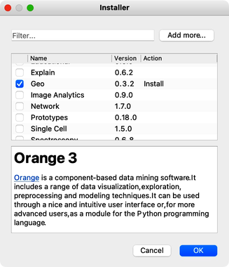
Orange comes with a geo add-on, which we will need to install first. Add-ons can be found in the menu under Options. Here we need to select a checkbox for the Geo add-ons. Clicking on the Ok button, the add-on will install, and Orange will restart.
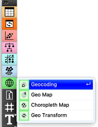
In the toolbox, we now have another group for Geo widgets.
The human development index data is available from the Datasets widget; we can type "hdi" in the filter box to quickly find it. Double clicking the line with the data set loads the data. Before doing anything else we should to examine it in the Data Table.
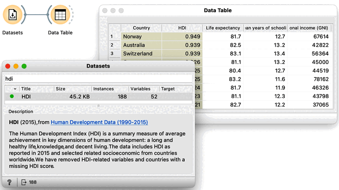
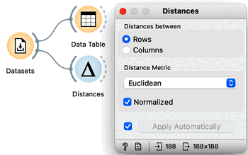
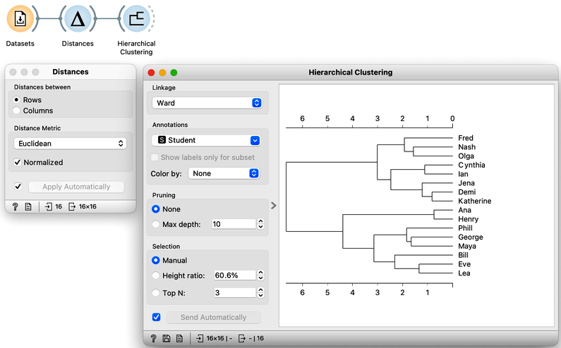
This data includes 188 countries that are profiled by 52 socioeconomic features. To find interesting groups of countries, we first compute the distances between country pairs. We will use the Distances widget with Euclidean distance and make sure that features are normalized. As this data set includes features with differing value domains, normalization is required to put them on a common scale.
In hierarchical clustering, where we add the Hierarchical Clustering widget to the workflow, we will use the Ward method for linkage and label the branches with the names of the countries. Ward method joins the clusters so that the data variance in the resulting cluster is decreased and often produces dendrograms with more exposed clusters.
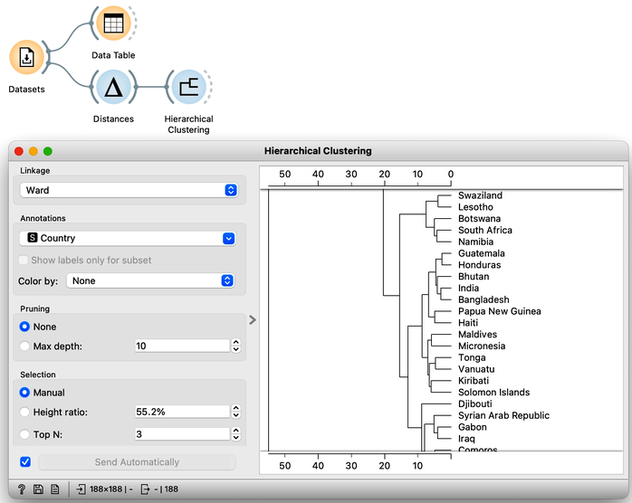
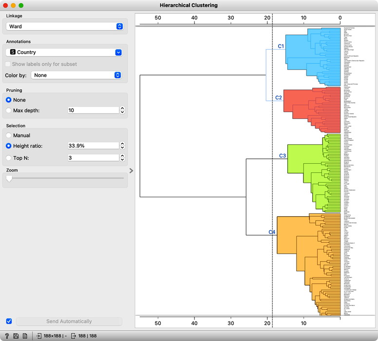
Our clustering looks quite interesting. We see some clusters of African countries, like Swaziland, Lesotho, and Botswana. We also find Iceland, Norway, and Sweden grouped together. And some countries of the ex-Soviet Union. Try to find each of these groups in the dendrogram! By zooming out the dendrogram we can find such a cut that will group the countries into, say, four different clusters.
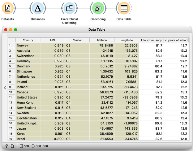
Let us take a look at these four groups on the geo map. To do this, we first need to add the Geocoding widget to the output of Hierarchical Clustering. The widget is already set correctly to use the country name as an identifier. By adding the Data Table we can double check the result and find that every row now includes extra information on the Cluster, which comes from the Hierarchical Clustering widget, and information on the latitude and longitude of the country, added by Geocoding.
We will pass this data on to the Choropleth Map, change the attribute for visualization to Cluster, and the aggregation to Mode. Also, check that Latitude and Longitude are read from the variables of the same name, and that Detail is set to the minimum level.
Well, here it is. The countries of our world clustered!
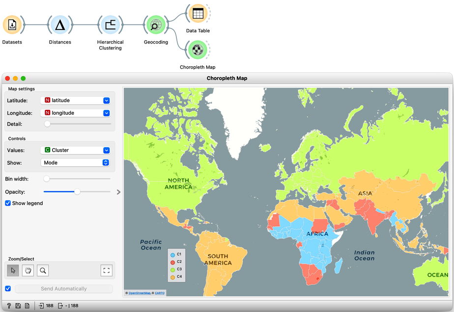
Looks interesting. What we refer to as developed countries are in one cluster. Countries in South America are clustered with some countries in Asia. And we also find a band of sub-Saharan African countries.
It is fascinating that although the data did not explicitly encode any geo-location information, the clusters we found were related to the country's geographical location. Our world really is split into regions, and the differences between countries are substantial.
Did we say "the differences"? So far, authors of this text did an abysmal job of explaining what exactly these clusters are. That is, what are the socioeconomic indicators that are specific to a particular cluster? Are some indicators more characteristic of clusters than others? Which indicators characterize clusters best? So many questions. It is time to dive in into the trick of cluster explanation.
Chapter 2: Explanations
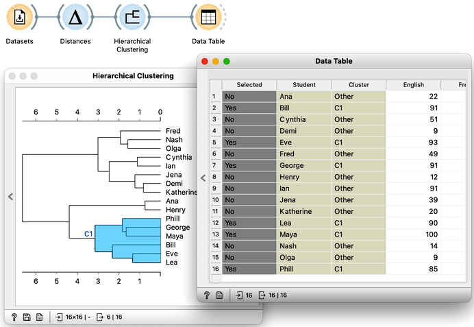
Hierarchical clustering, the topic of our previous chapters, is a simple and cool method of finding clusters in our data. Let us here refresh what we have learned on the course grades example from our previous chapters. The course grades data includes 16 students and seven school subjects. We measured the Euclidean distance between each pair of students and clustered the data accordingly. Let us use the Ward minimum variance method for linkage. This will join clusters so that the points in the resulting cluster are nearest the center. It is a bit more complicated than that, but the idea of Ward linkage is that the points in the resulting clusters are as close together as possible. Below is the workflow and the result of the clustering.
Our problem here, however, is not a clustering algorithm but how to interpret the resulting clustering structure. Why are Phill, Bill, and Lea in the same cluster? What do they have in common?
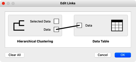
The hierarchical clustering widget emits two signals. Selected data as well as the entire dataset with an additional column that indicates the selection. Let me first show this in the Data Table widget. First, I will select a cluster with Phill, Bill, and Lea, and rewire the connection between Hierarchical Clustering and Data Table to communicate the entire data set. The Data Table now includes the "selected" column, that shows which data items, that is, which students were selected in the Hierarchical Clustering. Fine: Phill, Bill and Lea are among selected ones.
We would now like to find the features, that is, school subjects, which can differentiate between selected students and students outside the selection. This is something we have already done in our chapter on data distribution, where we constructed a workflow that told us which socioeconomic features are related to extended life expectancy? The critical part to remember is that we used Box Plot. Let us add one to the output of Hierarchical Clustering and rewire the signal to transfer all the data instead of just a selection. In the Box Plot widget, I have to set “Selected” as a subgrouping feature, and I also check “Order by relevance to subgroups”.
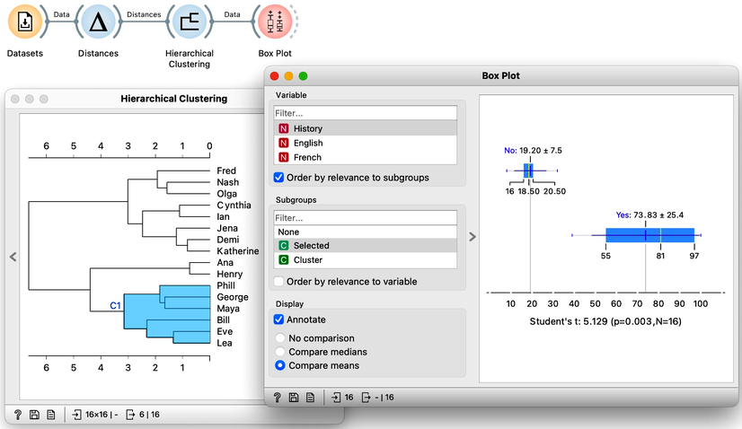
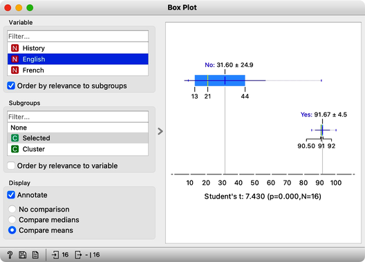
We find History, English, and French at the top of the list of variables. Taking a closer look at History, for example, we can see that Phil, George, and company perform quite well, their average score being 74. Compare that to the mediocre 19 of everyone else. In English, the cluster’s average score is even higher, at 92 compared to the 32 of everyone else. And the scores in French tell a similar story.
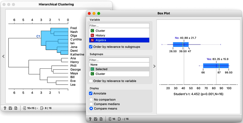
The cluster of students we have selected is particularly good in subjects from social sciences. How about a cluster that includes Fred, Nash, and Katherine? Their scores in History are terrible at 16. However with a score of 83, they do well in Algebra and are better than the other students in Physics. It looks like we have a group of natural science enthusiasts.
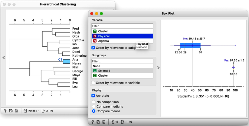
The only remaining cluster is the one with Ana and Henry. They love sports.
With the Hierarchical Clustering-Box Plot combination, we can explore any cluster or subcluster in our data. Clicking on any branch, will update the Box Plot, which, with its ordered list of variables, can help us characterize the cluster. Box Plot uses the Student’s t statistic to rank the features according to the difference between their distribution within the cluster and distribution of feature values outside the cluster. For instance, the feature that best distinguishes students in my current cluster is Biology, with a Student’s t statistic of 5.2.
Explaining clusters with Orange’s Box Plot is simple. We find it surprising that it was so easy to characterize groups of students in our data sets. We could use the same workflow for other data sets and hierarchical clusters. For instance, we could characterize different groups of countries we found from the socioeconomic data sets. But we will leave that up to you.
Chapter 3: Silhouettes
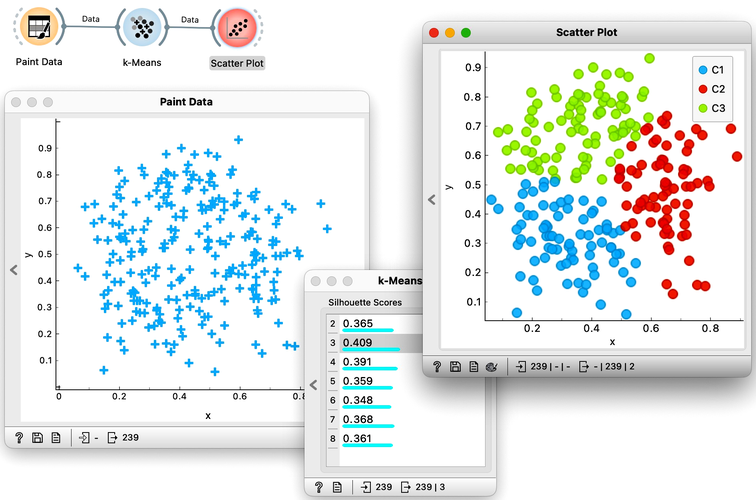
Not all data is created equal. Some are more centralized, and others stick out. There are inliers, and there are outliers. Let us explain these concepts concerning clustering and paint a data set with three clusters, a blue one, a red one, and a green one off to the side. We will use Orange's Paint Data widget for this.
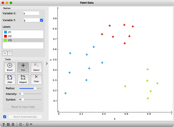
The data points in the green cluster are better separated from those in the other two clusters. Not so for the blue and red points, where several points are on the border between the clusters. We want to quantify how well a data point belongs to the cluster to which it is assigned.
We compute an average intra-cluster distance A from distances to points in the same cluster.
We can here invent a scoring measure for this, and we will call it a silhouette (because this is how it's called). Our goal: a silhouette of 1 (one) will mean that the data instance is well rooted in the cluster, while we will assign the score of 0 (zero) to data instances on the border between two clusters.
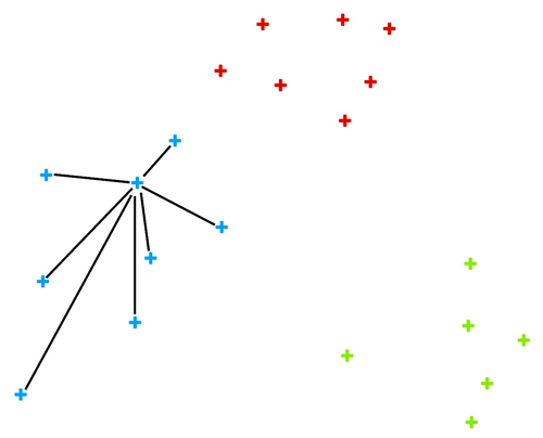
For a given data point (say, the blue point in the image on the left), we can measure the distance to all the other points in its cluster and compute the average. Let us denote this average distance with A. The smaller the A, the better.
On the other hand, we would like a data point to be far away from the points in the closest neighboring cluster. The closest cluster to our blue data point is the red cluster. We can measure the distances between the blue data point and all the points in the red cluster and again compute the average. Let us denote this average distance as B. The larger the B, the better.
The point is well rooted within its cluster if the distance to the points from the neighboring cluster (B) is much larger than the distance to the points from its cluster (A). Hence we compute B-A. We normalize it by dividing it with the larger of these two numbers, . Voilá, S is our silhouette score.
We compute an average inter-cluster distance B from distances to points in the closest foreign cluster.
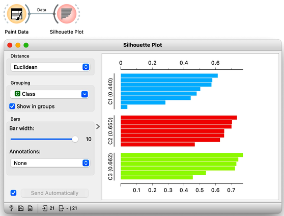
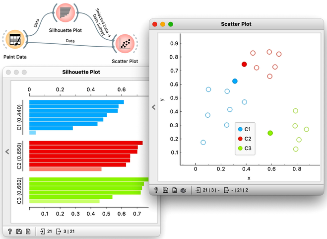
Orange has a Silhouette Plot widget that displays the values of the silhouette score for each data instance. Silhouette plot assumes that the data set includes a feature that reports on cluster membership. Our painted data has a feature with the name "Class".
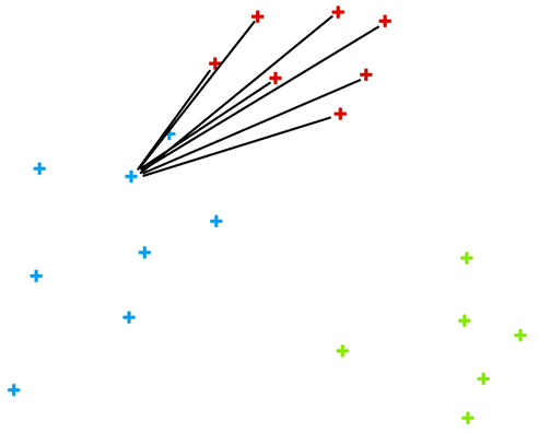
We can also choose a particular data instance in the silhouette plot and check its position in the scatter plot. Below, we selected three data instances, one from each cluster, with the worst silhouette scores and used Orange to see where they lie in the scatter plot.
Of course, computing silhouettes and visualizing the position of inliers and outliers look great for data sets with two features, where the scatter plot reveals all the information. In higher-dimensional data, the scatter plot shows just two features at a time, so two points that seem close in the scatter plot may be far apart when all features - perhaps thousands of gene expressions - are taken into account.
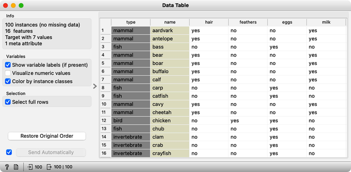
To see how we can use silhouettes to spot outliers in multi-dimensional data, consider zoo data sets from the Datasets widget. Which are the three mammals that stick out most? Why? Why do some of the animals in this data set have negative silhouettes? What would that suggest?
Chapter 4: k-Means
Hierarchical clustering is not suitable for larger data sets due to the prohibitive size of the distance matrix: with, say, 30 thousand data instances, the distance matrix already has almost one billion elements. If the matrix stores floating numbers that each requires 32 bits of memory, just storing such distance matrix would require a prohibitive 32 TB of working memory. An alternative approach that avoids using such large distance matrix is k-means clustering.
Notice that a squared distance matrix for hierarchical clustering is replaced with a matrix that stores the distances between all data points and k centers. Since k is usually small, this distance matrix can easily be stored in the working memory.
Clustering by k-means randomly selects k centers, where we specify k in advance. Then, the algorithm alternates between two steps. In one step, it assigns each point to its closest center, thus forming k clusters. In the other, it recomputes the centers of the clusters. Repeating these two steps typically converges quite fast; even for big data sets with millions of data points it usually takes just a couple of ten or hundred iterations.
Orange's Educational add-on provides a widget Interactive k-Means, which illustrates the algorithm. To experiment with it, we can use the Paint Data widget to paint some data - maybe five groups of points. The widget would start with three centroids, but you can add additional ones by clicking anywhere on the plot. Click again on the existing centroid to remove it. With this procedure, we may get something like show bellow.
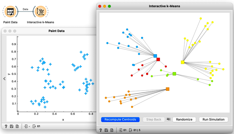
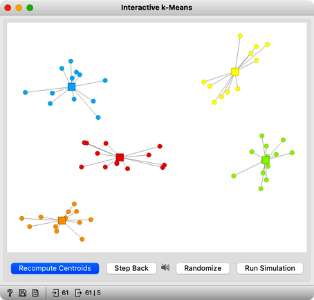
Now, pressing the return key, or clicking on Recompute Centroids and Reassign Membership button we can simulate the k-means algorithm. We can notice its fast convergence. The resulting clustering for the data we have painted above is shown below.
Try rerunning the clustering from new random positions and observe how the centers conquer the territory. Exciting, isn't it?
With this simple, two-dimensional data it will take just a few iterations; with more points and features, it can take longer, but the principle is the same.
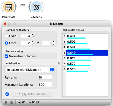
How do we set the initial number of clusters? That's simple: we choose the number that gives the optimal clustering. Well then, how do we define the optimal clustering? This one is a bit harder. We want small distances between points in the same cluster and large distances between points from different clusters. Oh, but we have already been here: we would like to have clustering with large silhouette scores. In other words: we can use silhouette scoring and, given the clustering, compute the average silhouette score of the data points. The higher the silhouette, the better the clustering.
Now that we can assess the quality of clustering, we can run k-means with different values of parameter k (number of clusters) and select k which gives the largest silhouette. For this, we abandon our educational toy and connect Paint Data to the widget k-Means. We tell it to find the optimal number of clusters between 2 and 8, as scored by the Silhouette.
Works like a charm.
Except that it often doesn't. First, the result of k-means clustering depends on the initial selection of centers. With unfortunate selection, it may get stuck in a local optimum. We solve this by re-running the clustering multiple times from random positions and using the best result. Or by setting the initial position of centroids to the data points that are far away from each other. Or by slightly randomizing this selection, and running the whole algorithm, say, ten times. This later is actually what was proposed as KMeans++ and used in Orange's k-Means widget.
The second problem: the silhouette sometimes fails to correctly evaluate the clustering. Nobody's perfect.
The third problem: you can always find clusters with k-means, even when they are none.
Time to experiment: use the Paint Data widget, push the data through k-Means with automatic selection of k, and connect the Scatter Plot. Change the number of clusters. See if the clusters make sense. Could you paint the data where k-Means fails? Or where it works really well?
Chapter 5: k-Means on Zoo
There will be nothing much new in this lesson. We are just assembling the bricks we have encountered and constructing one more new workflow. But it helps to look back and admire what we have learned. Our task will be to take the zoo data set, find clusters and figure out what they are. We will get the zoo data set from the Datasets widget. It includes data on 100 animals characterized by 16 features. The data also provides animal names and the type of animal stored in the class column.
For a while, we will pretend we do not know about the animal type and remove the "type" variable from the data using the Select Columns widget.
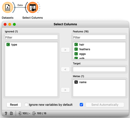
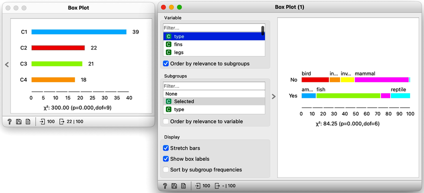
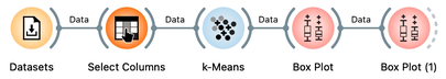
The widget k-means tells us there may be four or five clusters; the silhouette score differences for these two values of k are tiny. The task here is to try to guess which types of animals are in which cluster and what their characteristics are. We could go ahead in several ways, and to select the target cluster, we are tempted to say that we should use the Select Rows widget, which would be appropriate. But instead, let us use the Box Plot for cluster selection and another Box Plot to analyze and characterize clusters.
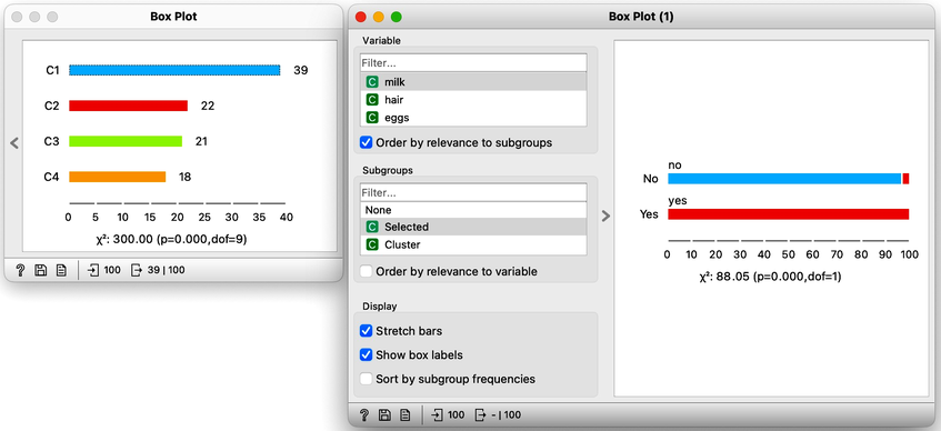
On the first Box Plot: the k-Means widget adds the feature that reports for each data instance on the cluster membership. No wonder the feature is called "Cluster". We use the box plot to visualize the number of data instances in each cluster and to spread the visualization into separate rows, and we will subgroup the plot by the same feature:
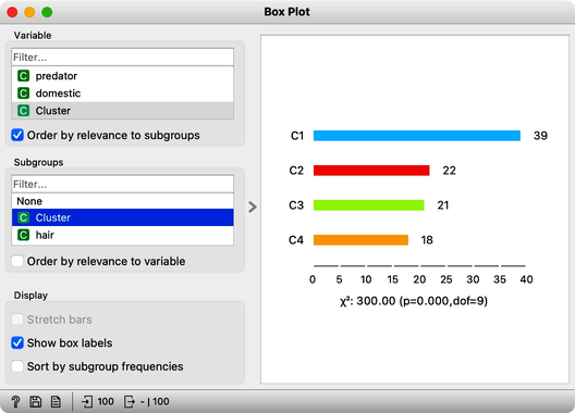
We will use this Box Plot for cluster selection: click on any of the four bars (four is the number of clusters we selected in the k-Means widget), and Box Plot will output the data instances belonging to this cluster. We will not care about the selected data but rather pour the entire data set into the next Box Plot. Remember to rewire the connection between two Box Plots accordingly. When outputting the entire data set, the Box Plot will add the column "Selected" to report whether the data instance was selected. In our case, the Selected column will report if the data instance belongs to our target cluster. At this stage, this is our workflow:
Now for the fun part. We can select the first cluster to find that the feature that most define it are milk, hair, and eggs. Examining this further, we find that all the animals in the first clusters give milk, have hair, and do not lay eggs. Mammals.
In the second (red) cluster, most animals have fins, no legs, and are aquatic. Fish. But there are also some other animals with four legs and no fins, so this cluster is a bit of a mixture. The third cluster is easier, as there are animals with feathers with two legs. Fish. Animals in the fourth cluster have no backbone and are without tails. This cluster is a harder one, but with some thinking, one can reason these are insects or invertebrates.
There are many more things that we can do at this stage, and here are some ideas:
-
Link the output of the last Box Plot to the Data Table and find out what the animals with specific characteristics are, that is, what their name is.
-
Check for some outliers. Say, two animals give milk but are not in the first (mammalian) cluster. Which ones are these?
-
Go back to Select Columns, place the type in the meta-features list, and check out the distribution of animal types in the selected cluster.