This quiz consists of 0 mandatory questions where you can gather 0 points.
You will complete the quiz by answering all the questions and gathering at least 0 points.
Answered: 0 / 0
Achieved points: 0 (NaN %)
Introduction to Machine Learning
A gentle introduction to unsupervised and supervised machine learning.
Which NBA player handles the ball most like Luka Doncic? Ever wondered which tennis player’s serving style is most like Serena Williams'? Which cheese has a flavor profile closest to Brie? Among the vast array of tropical forests, which one shares the most similarities with the Amazon? Which contemporary film director can be compared to the legendary Alfred Hitchcock in cinematic style? Is watermelon really similar in nutritional value to grapes and cherries? Is the world truly divided socio-economically from North to South? And for those captivated by the prose of Jane Austen, which modern author comes closest in narrative style?
In this course, we won’t answer all these questions, but we’ll explore approaches that might. With the right data representing objects of interest—like foods with nutritional values, tennis players with service statistics, or countries with socioeconomic indicators—these questions become easier to tackle. We can assess similarities, group similar objects, and interpret their characteristics. If the data is already grouped, we can even build models to classify new objects into these groups.
Finding groups is called clustering, or, in fancy machine learning lingo, unsupervised learning. Once the groups exist, classifying new objects into them is known as classification, or, for the machine learning aficionados, supervised learning.
The lessons below are a gentle introduction to classification and clustering—or, if we wanted to sound more scientific :), (we don’t), supervised and unsupervised machine learning.
Data profiling, similarity measurement, and data clustering are essential tasks in machine learning. Therefore, they are a good place to start our series of tutorials on AI.
The tutorial is hands-on: to complete it, you'll watch videos and answer quizzes. To get started, please download and install Orange, our go-to data science software used throughout the tutorial series. Sure, there are plenty of other machine learning tools out there, but we picked Orange for its simplicity and its cool combo of visualization and machine learning. But hey, the course isn't about Orange—it's about the core concepts of machine learning!
So, welcome to the introduction to Machine Learning class! And yes, watermelons are nutritionally similar to grapes and cherries. And the world is still a divided place. Read on and watch the videos to see how we can figure that out from the data.
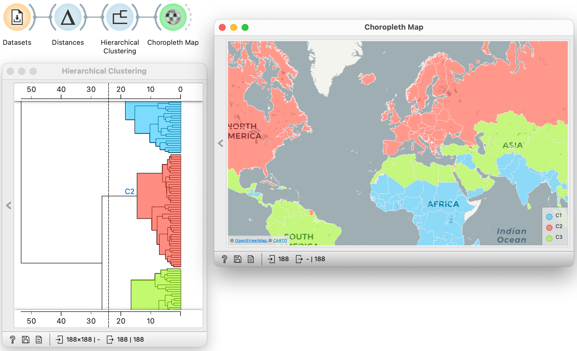
The material in this course was developed by the Biolab group at the University of Ljubljana and is shared under the Creative Commons CC BY-NC-ND license. The development of the learning material on this site was founded by the European Union through the ARISA project. The development of Orange Data Mining and associated environments was in part supported by Slovenian Research and Innovation Agency, EU Commission, Google.org, Chan Zuckerberg Initiative, and Open Software Foundation. Views and opinions expressed are however those of the author(s) only and do not necessarily reflect those of the European Union or the European Education and Culture Executive Agency (EACEA). Neither the European Union nor EACEA can be held responsible for them.

Chapters
Chapter 1: Data exploration
... where we start using Orange, learn the mechanics of visual programming, and get started with some basic data analysis.
We begin our hands-on tutorial with socioeconomic data from the Human Development Index. Which country has the longest life expectancy? Is life expectancy related to years spent in school? In which part of the world are there countries where life is too short? Here is a video where we use Orange to answer some of these questions.
The video showed how to use Orange and its visual programming interface to load and explore the data. Now it is up to you, dear trainee: use Orange, load the Human Development Index data using the Datasets widget, and display the data in the Data Table. You will need to construct a workflow similar to the one shown here:
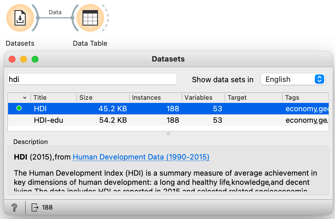
Open the Data Table widget (double-click the widget icon) and use it to answer the following questions:
How many countries does our data include? (1pt.)
According to our data (published in 2015), which is the country with the longest lifespan? (1pt.)
Which is the country with the largest gross national income per capita? (1pt.)
Now use the scatterplot to show the relationship between life expectancy and average years of schooling.
Which country sticks out with relatively high number of years their citizens spend in schools and relatively low live span? (1pt.)
Use the Scatter Plot widget to find out which of the following indicators best correlates with mean years of schooling. (1pt.)
If you are wondering how to save your work in Orange, here is the video with explanation. We will continue to look at the relationships between the two variables. You have already thought about correlations for the question above. Correlations between variables can be quantified, and the following video shows how.
What is the Pearson correlation between life expectancy and mean years of schooling? (1pt.)
Check out the Wikipedia page for Pearson correlation coefficient.
The more the two socioeconomic indicators are positively correlated, the closer the Person Correlation should be to one of the following values. (1pt.)
Let us change the dataset and look at the employee data. Open the Datasets widget and load the employee turnover data.
Just a note: we will use this data here (and for now) only because it profiles the employees in an organization, and we will not explicitly relate the employee profiles to the question of whether the employee will stay or leave the organization, as captured by the Attrition attribute.
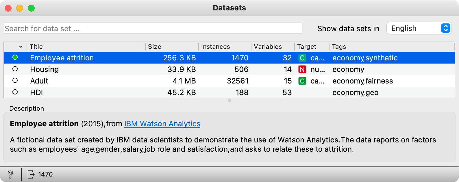
How many variables does employee attrition data set use to profile the employees? (1pt.)
Which of the following variables is monthly income most closely related to? (1pt.)
Often the answers we get from the data are not so surprising, but they are still valuable if they confirm our beliefs or are consistent with common knowledge. Looking at the data by observing it in a spreadsheet or visualizing it in different graphs allows us to become familiar with it and helps us spot any data errors. It helps to check the data thoroughly before we do any machine learning. So far, we have only used the scatterplot for visualization, and it is time to familiarize ourselves with two other visualizations, the bar chart (the distribution widget) and the box plot.
Using the attrition data set and the Distributions widget, answer the following questions. Please note: when the class variable is present, Orange automatically uses it to split all the distributions, so that they can be compared by the class value. For now, disregard the class by setting "Split by" in the Columns pane to None.
Are there more males or females in the attrition data set? (1pt.)
What is the educational background of most of the employees in this data set? (1pt.)
Where do most employees live in relation to the company's quarters? Answer this by looking at the distribution of distance from home. (1pt.)
Now use the Box Plot. Set Subgroups to None, as in the following screenshot; again, we are not interested in the differences between those who leave and those who stay. Orange's Box Plot uses standard visual notation to show things like the mean (blue bar), the median (yellow bar), and the values of the 1st and 3rd quartiles. You can always get help on a particular widget by clicking the "?" icon in the widget's status bar at the bottom left of its window.
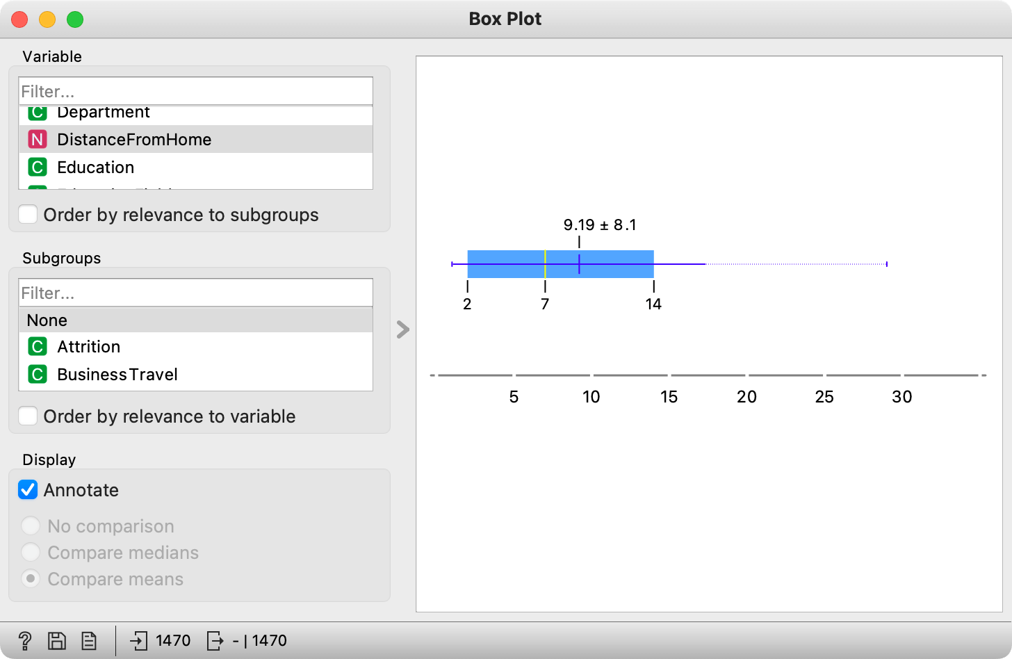
Using the Box Plot widget, answer the following questions:
What is the mean age of the employees in the attrition data set? (1pt.)
What is the median age of the employees in the attrition data set? (1pt.)
Chapter 2: Distances
... where we use the data to find similar data items, and quantify similarities by measuring distances in multi-dimensional spaces.
We agree that the term "multidimensional" sounds kind of sophisticated. But measuring distances between data points, as we will learn, is just like measuring distances in real life with rulers and tape measures. In data science, we measure distances to find neighbors and outliers. We ask questions like: Is the planet Venera more like Jupyter or Mars? Is the company Siemens more like Proctor & Gamble or Google? Which shampoo is like Head & Shoulders, but maybe cheaper? And nutritionally, are tomatoes more like cauliflower than sweet potatoes? If we have data to profile each of these items, finding answers to all of these questions is not only easy, it is domain independent.
Let's dive into measurement of distances first. We start with distances in two dimensions.
It turns out, as we will see in future videos, that measuring distances in multiple dimensions is just as easy as it is with two-dimensional data. For now, we will pretend that we know how to do this and consider a multi-dimensional data set and the same set of widgets as in the video. Let us use the data on nutritional information food ("Food Nutrition Information") available from the Dataset widget.
How many food items are in the nutritional information data? (1pt.)
Which of the food types is best represented in this data set (hint: use Box Plot)? (1pt.)
Estimate the distances between different food items. For a distance metrics, use Euclidean distance on normalized data features (open the Distances widget and make sure this is the selected metrics). Visualize the distance in the Distance matrix, and answer the following question.
Which of the following foods is asparagus most similar to in terms of nutritional value? (1pt.)
Even for such small data, the distance matrix is large, and as the data gets larger, it becomes difficult to summarize anything from it. For example, it takes some patience and time to find out which foods from our database are most similar in nutritional value to, say, asparagus. It turns out that they are green beans, summer squash, and peaches, in this order, with the last one being somewhat unexpected. While we can check these out from the distance matrix, there is another widget in Orange called Neighbors that we can use. Here is the workflow:
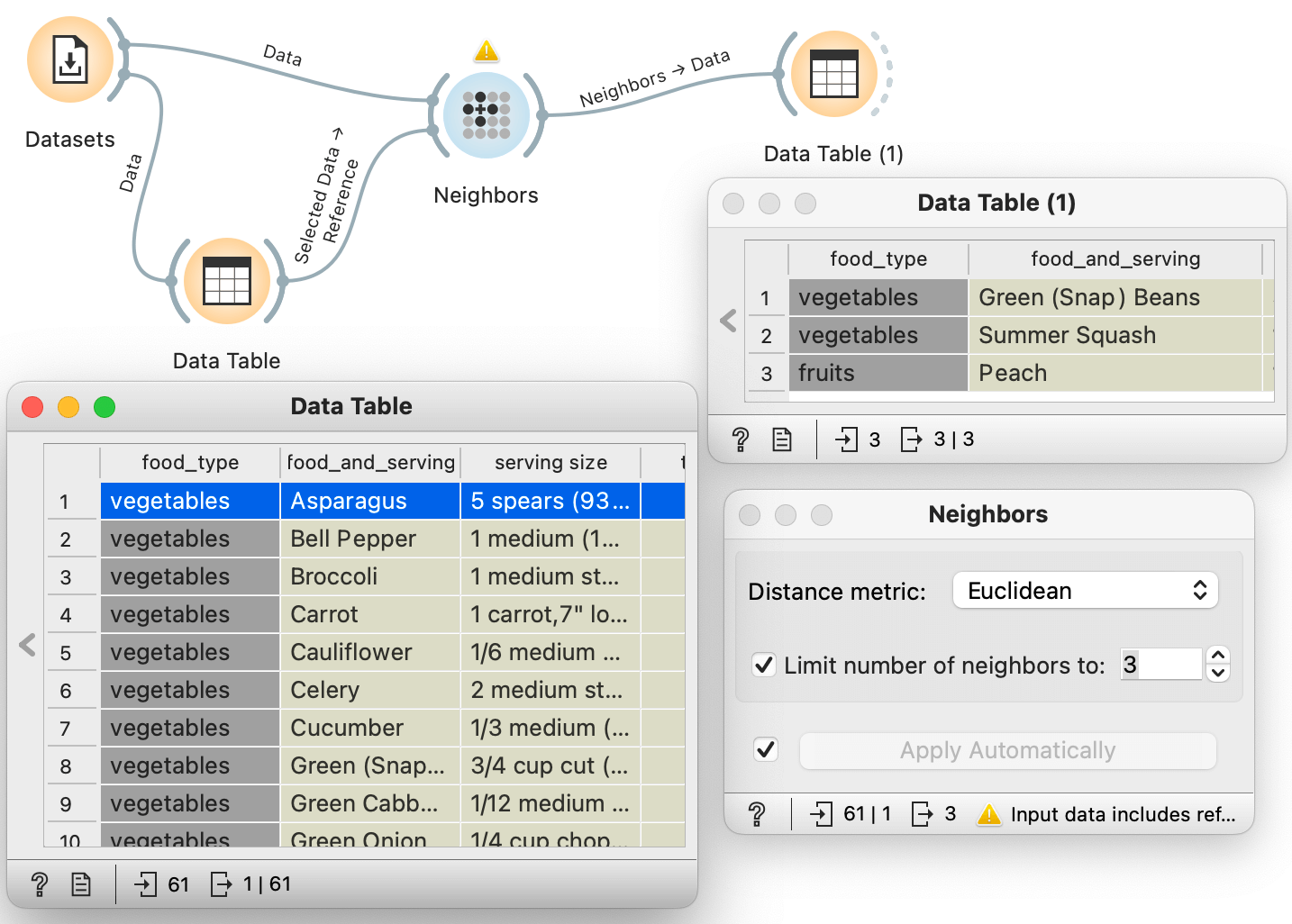
Notice that the Neighbors widget receives two inputs: all the nutritional information from the Datasets widget, and the foods we selected from the Data Table. We set up this workflow so that we first connected Datasets and Neighbors to let Orange know that this is where all the data is coming from. We also instructed Neighbors to output only the three closest data instances.
Construct the same workflow to answer the following questions. You can also play with the layout of your screen and the many windows Orange creates, one for each widget, using Orange's Window menu. For example, there is a useful shortcut to bring all widget windows to the front.
Nutritionally, which is the most similar food to the grapefruit? (1pt.)
Nutritionally, which is the most similar food to the lobster? (1pt.)
Nutritionally, which food item is not in the top three most similar items to plums? (1pt.)
Works great, right? With just a few nutritional characteristics describing the food, we can actually find similar foods that make sense. The last workflow was also interesting, as it combined several widgets to create a nearest neighbor browser that reacted instantly to any change in the data selection. Visual programming and visual analytics in action. And we have only just begun our data science education!
Chapter 3: Clustering
... where we learn about our first machine learning approach, a hierarchical clustering, and use it to find interesting groups of foods and countries.
The nearest neighbors we find also suggest that there are likely groups of foods in our dietary information data. Instead of just nearest neighbors, would it be possible to find the entire clustering structure? And display it in a nice visualization? There is such an algorithm, and the result is a visualization called a dendrogram. Watch the videos below to learn about it. The first video talk about measuring distances (and with these, similarities) between clusters.
The second video introduces the visual representation of the clustering result, called a dendrogram.
And the final video in our hierarchical clustering series discusses something we already know intuitively and have used before: estimating distance in multidimensional data.
Here we will work again with the food information data from our previous chapter. We start with a simple question, just to remind us that the data is dimensional.
Our nutritional data describes foods with numerical features that place each food in a multidimensional space. What is the dimensionality of that space? (1pt.)
Now use hierarchical clustering and the resulting dendrogram to answer the following questions. Keep the widget settings at default, that is, Euclidean (normalized) distance metrics in Distances and Ward linkage in hierarchical clustering.
Wich other foods are in the cluster with watermelon? (1pt.)
All fish are in one big cluster? (1pt.)
All fruits are in one big cluster (1pt.)
What food cluster with mushrooms? (1pt.)
Chapter 4: Decision Boundary
... where we start thinking about classification (oops, sorry, supervised learning).
Artificial intelligence, as we currently know it, is simple. No kidding. In essence, AI of today is just like throwing some crosses and circles on a paper, and finding a line that separates them. Like, for instance, in the figure below.
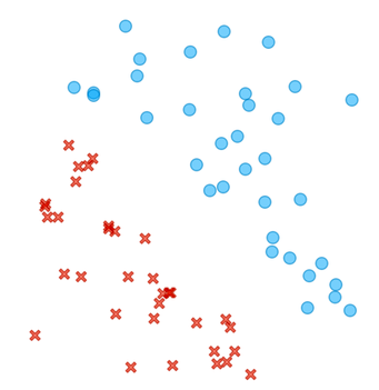
Can you draw a line between circles and crosses? How about finding a dividing line in this more complicated case?
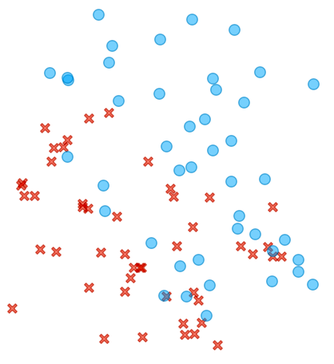
There is no clear cut here, but most of the circles are in the upper right and the crosses are in the lower left part of the plane.
We will learn that machine learning is really about finding that dividing line, the best one possible given the data. While sometimes, as in our first figure above, the line will perfectly divide the area of the crosses and circles, in real life, the circles and crosses would most often overlap, and the line would leave some circles on the side of the crosses and vice versa. The machine learning method that draws such a line is called logistic regression, and it is the key element of neural networks and all the deep learning techniques we use today for generative models.
Back to circles and crosses. And the line that separates them. Consider a few such lines for the same circles-crosses data below.
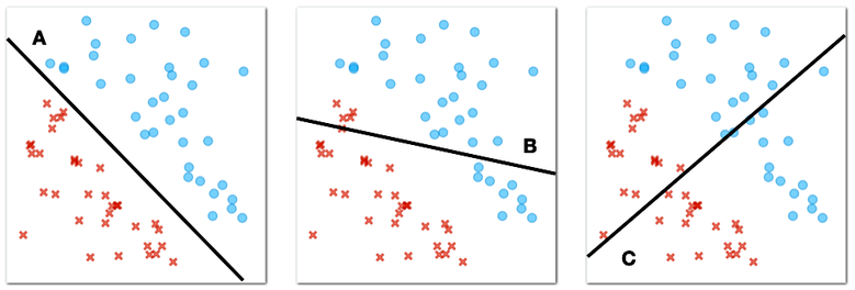
What line best separates circles and crosses? (1pt.)
The circles and crosses from our figure above are "linearly separable". "Linear" because we can use the straight line to separate them, and "separable" because our separator perfectly splits our two classes, the circles and the crosses, so that on one side of the plane there are only circles and on the other side of the plane there are only crosses.
Now consider another case where the circles and crosses are positioned as shown in the figure below.
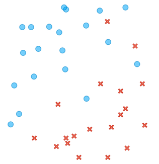
Here, there is no line that would perfectly divide the plane so that we would find all the circles on one side of the line and all the crosses on the other side. However, among many dividing lines, there are some that are better and some that are worse. Consider the following three lines.
Lines like these are called decision boundaries in machine learning. "Boundaries" because they define the area between circles and crosses, or as we call them in machine learning, two different classes of objects, and "decision" because we can use them to classify new objects.

Which line best separates the circles and crosses in the figure above? (1pt.)
Lines define a decision boundary, and we can use them to classify new objects. For example, the one we marked with a hollow square in the figure below. We only know the position of this object, and now we have to decide whether it is a circle or a cross.
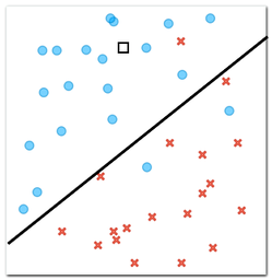
According to our decision boundary, i.e., a line we have drawn that separates circles from crosses, which class does a new object, marked with a square in the figure above, belong to? (1pt.)
Now consider four new objects for which we need to determine the class. We know their positions, represented by squares, and we also know that each of these objects should be either a cross or a circle.
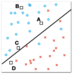
Which of the four new objects is most likely to be a circle? (1pt.)
Why? (1pt.)
There is a type of machine learning that finds a decision boundary in the form of a line when the data lies in a plane like our crosses and circles above. This algorithm is called logistic regression. Interestingly, logistic regression not only sets the decision boundary, but also assigns probabilities so that the probabilities of one class or the other are greater for the objects that are farther from the decision boundary, that is, farther from the line.
Now it is time to see logistic regression at work on some real data.
Chapter 5: Logistic regression
...where we introduce one of the oldest (from the 1940s!) yet most widely used machine learning models: logistic regression. Have we told you that modern AI is basically a combination of millions or trillions of logistic regressions? We didn’t say it outright, but we hinted that anything capable of drawing a line between crosses and circles is. And that’s exactly what logistic regression does. It's the fundamental LEGO brick of today’s modern AI.
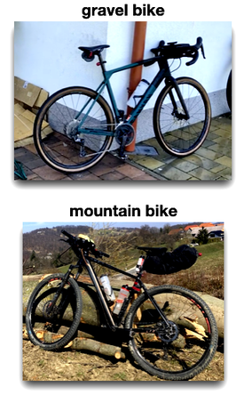
One of our colleagues, let us call him Janez for simplicity's sake, likes to ride his bike. He has two bikes, a gravel bike and a mountain bike. Gravel bikes are good for riding on both paved roads and rough gravel roads. Mountain bikes are more for, well, riding in the mountains. Like all serious cyclists, Janez uses Strava, an application that tracks rides and records various parameters, such as distance traveled and time spent on the bike, also called moving time. Along with these parameters, Janez also recorded which of the two bikes he was riding.
Our goal here is to build a predictive model that, given the planned route and the estimated distance and time spent for the trip, can suggest to Janez which of the two bikes he should take.
We start with the data. Janez has recorded all of his trips in 2023, and the data from these trips, including the distance and time spent for the trip, is available through the Orange Datasets widget. Using this widget, filter the datasets so that the widget shows only those with the word "bike" in the title, and select the dataset with the title "Gravel vs: Distance and Time". Then look at the data in the Data Table widget.
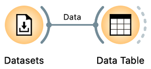
You can find the Datasets widget by right-clicking on the Orange canvas, typing "data" in the search box, and then clicking the line with the widget's name. Double-click the widget icon to open it. In the filter box, type "bike" and double-click the line that says "Gravel vs. Mountain Bike Rides: Distance and Time". Close the widget, draw the connection from the right antenna of the Datasets widget, and add a Data Table widget.
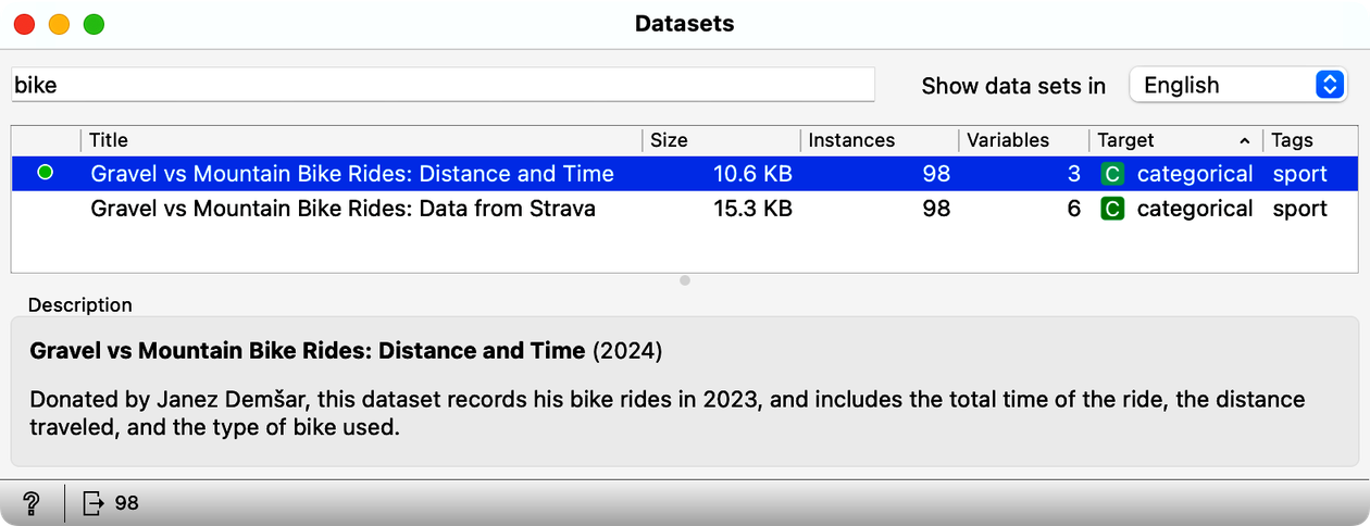
How many rides does this data set include? (1pt.)
Other than a class label, gravel or mountain, our bike riding data set contains only two variables, travel time and distance traveled. It is convenient to display this data in a scatterplot, a graph that can visually show the relationship between these two variables. Each point on the scatterplot represents a single bike ride, with one axis (for example, the x-axis) showing the travel time and the other axis (the y-axis) showing the distance traveled. To view this graph, add the Scatterplot widget to the output of the datasets. Your workflow should now look like this:
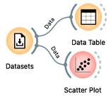
Looks like when spending the same time on the road, Janez travels faster on the gravel bike (check out the scatter plot). We wonder why that is?
Open the Scatter Plot widget. As expected, travel time increases with distance. But we are here to find out if these two parameters tell us which bike was preferred for a particular combination. For example, when Janez spent 3 hours on the bike, he used a mountain bike when the distance was about 30 km and a gravel bike when the distance was about 60 km.
Look at the scatterplot from our data set. Can you draw a line that separates gravel rides from mountain bike rides? (1pt.)
Janez is planning his next ride. The ride is 60 km and his trip planning app tells him it will take 5 hours. Which bike should he take? (1pt.)
Janez has had enough of mountain biking. The previous ride from our last question, or should we say, from our decision support task, was just too hard and he spent 5 hours sweating uphill. Now he wants to do some gravel riding and he has three different rides in mind:
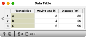
Which of these three rides is best suited for gravel bike? (1pt.)
This last question was probably a bit boring, as you had to carefully project the three points onto the scatterplot and somehow estimate the probability that Janez took the gravel bike, given the distance and travel time. Why work with Orange if we have to do all the guessing manually? And you are right. Time to do some machine learning and prediction in Orange.
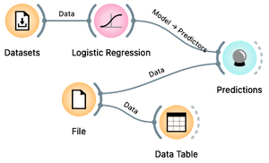
Here is our plan: we will use our current travel data to build a predictive model for Janez's bike. We will use logistic regression. We will also load separate data for the three candidate trips into Orange. Finally, we will use the Predictions widget to which we will send both the built model and the new data set. Here is the workflow we will use:
We already have a Datasets widget on our canvas. Draw a line from its antenna to add the Logistic Regression widget. Draw another line from the output of the Logistic Regression to add the Predictions widget. Then download a file few-more-rides.xlsx and load it using a file widget. You can either add a File widget, open it, press the "..." button and locate the downloaded file, or just drag the icon of the file from where you downloaded it to the Orange's canvas; this will automatically place a File widget with the loaded data. Now add a Data Table widget to check if the data was loaded correctly, and also connect the File widget to the Predictions.
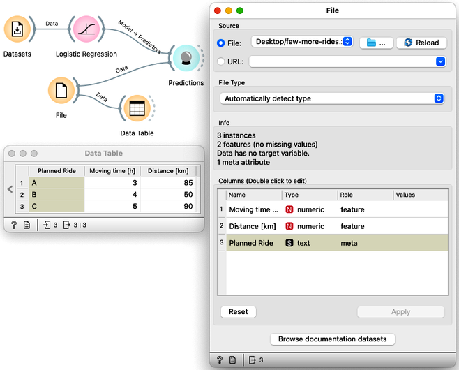
When loading a new dataset, the first thing to do is to verify that the data has been loaded correctly and to check out the data. First, the File widget should report what features the data contains: this should include travel time and distance. Then the Data Table widget displays the data and everything looks fine.
Now we are ready to see machine learning in action. Open the Predictions widget and see what the logistic regression tells us.
In this order, what are the recommended bikes for planned routes A, B, and C? (1pt.)
In addition to classes, Logistic Regression can also assign probabilities to its recommendations. In the Logistic Regression widget, change "Show probabilities for" from "None" to "Classes known to the model".
For which of the three candidate trips is the logistic model most undecided? (1pt.)
What is the probability that trip B requires a mountain bike? (1pt.)
Chapter 6: Accuracy
...where we emphasize that we can’t just blindly trust machine learning models; we need to first verify if they are accurate.
Above, we used logistic regression to build a model from a data set of bicycle trips and apply it to predict the types of bicycles needed for new, candidate trips. We often refer to the data from which we build a model as the training data set. Logistic regression worked well and helped us decide both the type of bike and the probabilities that this type of bike is the one Janez really needs for this type of trip.
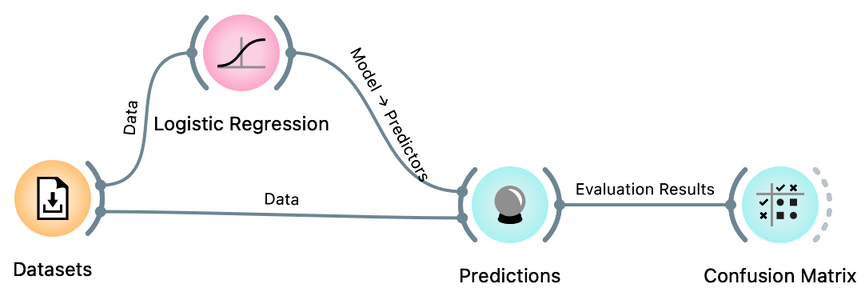
We can build such models on any data set, but the question is how accurate these models are. Here we will learn how to evaluate such accuracy. We will start with our training set, develop a logistic regression model on it, and find out in how many cases from the training set the logistic regression got it wrong. We call such an estimate training set accuracy. Using the same bicycle data set from our previous chapter, we will develop the following procedure:
We already have the Datasets widget, properly loaded with our ride data, and Logistic Regression and Predictions. From your previous workflow, remove all other widgets and instead of the candidate bike rides, send our training data to Predictions.
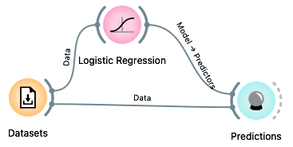
The Predictions widget now shows the predictions for all of our 98 rides from the training data set. It also reports the classification accuracy of the resulting predictions, shown in the CA column of the performance scores section. The classification accuracy of logistic regression on the training set is about 78%, which means that out of 98 trips, the logistic regression predictions were correct 98 x 0.78 = 76 times.
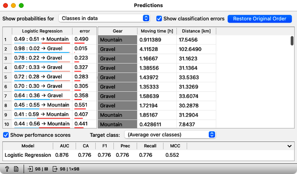
Not bad. But where are the mistakes? There's another widget to check where all the misclassifications went, and it's called the Confusion Matrix. Connect it to the output of Predictions, and check it out (double-click on the Confusion Matrix icon) to answer the next two questions.
You know the drill: drag the line from the Predictions widget, release the mouse, and then start typing "confusion" to get the Confusion Matrix widget on top. Press Return to add it to the canvas.
How many gravel rides where correctly classified? (1pt.)
How many mountain bikes rides were incorrectly classified as gravel bike rides? (1pt.)
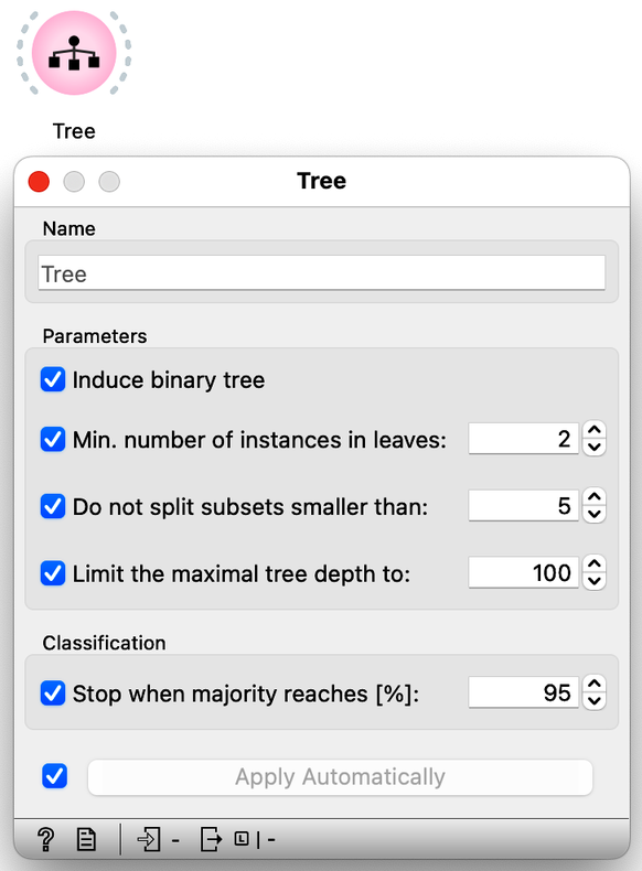
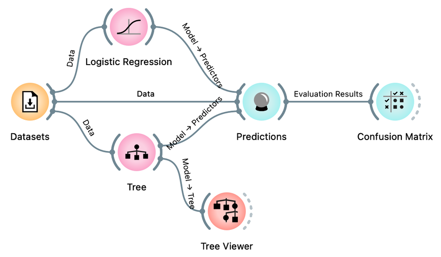
Besides logistic regression, you already know another learning algorithm: classification trees. The tree (the widget and its default setting; don't change anything for now) is great because we can analyze and interpret it, and sometimes it achieves high predictive accuracy. Sometimes. But not always. It is time to compare them to logistic regression. Try it yourself. Here are a few tips: just like logistic regression, the tree takes the data and can output a model. And that model can be fed into Predictions to assess classification accuracy. In essence, you already have the whole workflow, only the tree is missing.
How does the classification accuracy of the tree compare to that of logistic regression? Tip: classification accuracy (CA) is reported in the Predictions widget. (1pt.)
Hmm. Interesting. Because logistic regression has this linear decision boundary, we might think it is just right for our bicycling data set. Maybe we should look at what the tree looks like. We can use the Tree Viewer widget to visualize it and maybe decide if it tells us something about the problem (hint: do not expect much). To do this, we simply add the Tree Viewer widget to our workflow:
How many nodes does our classification tree have? (1pt.)
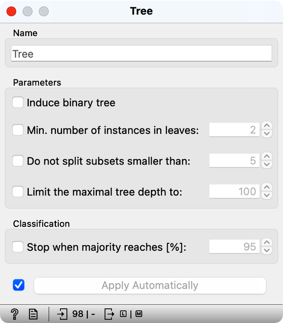
The tree learning algorithm has several parameters that limit the size of the tree. With the default training parameters, our tree was somehow manageable, although it was too large to fit into a reasonably sized computer window. Let us change these parameters by turning off all tree pruning methods.
How many nodes does the classification tree have after switching off all the tree prunning approaches? (1pt.)
Compared to the pruned tree, did the classification accuracy of the tree with pruning turned off increase or decrease? After turning off tree pruning, the accuracy... (1pt.)
We could close now, forget about logistic regression, and just use the trees. But something smells fishy. On our training data, the unpruned, fully grown tree model is very large. In fact, its leaves contain very few, often only one data instance. It is as if the tree cuts the space of our two features into very small regions containing only one of the bike types. In fact, the model is so complex that it remembers the bike type for all bike rides. No wonder it can then correctly classify all the bikes in the training set. Trees can build complex models that remember data instances well, and will outperform simple logistic models on the training set most of the time.
Did we say "on the training set"? Hm, what would happen if we estimated the accuracy differently? So we would test the models on the data set that was not seen during training. Here is our plan: let us split our data in half, use the first half of the data for training, and the remaining half for testing.
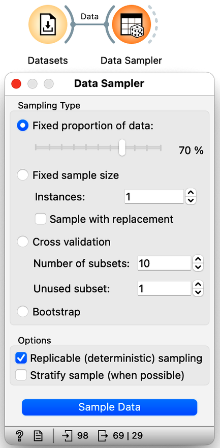
We will use the Sampler Data widget to split the data into training and test sets. We will leave the setting of this widget as it is, with 70% of the data going into a sample (for our training) and the remaining 30% of the data going into the test. Our workflow should look like this:
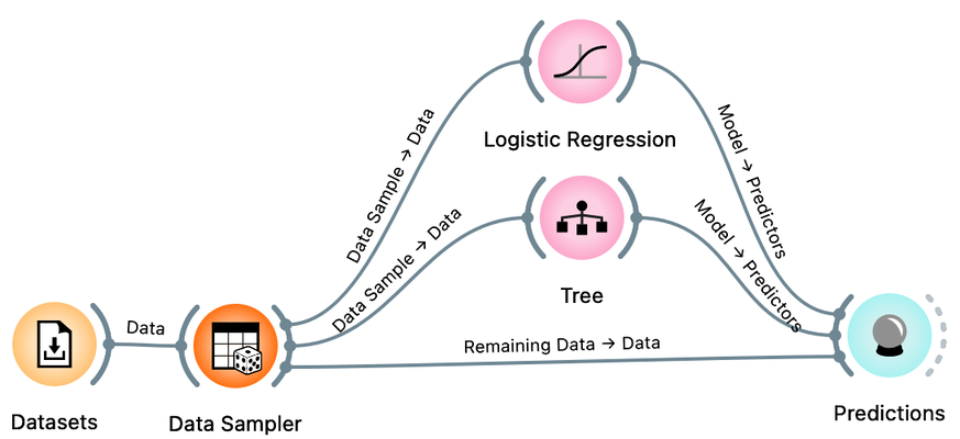
There is a trick here. When you connect the Data Sampler to the Predictions widget, Orange automatically connects the Data Sampler output to the Predictions. In Orange, widgets can have multiple outputs. Data Sampler can output the data sample or the remaining data instances that are not in the sample. To do this, we need to rewire the initial connection between the Data Sampler and the Prediction widget. Double-click on the line connecting the two widgets and rewire the connection as shown below:
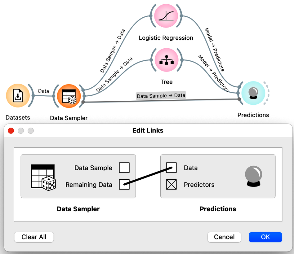
We are now ready to compare logistic regression and trees based on the accuracy estimated from the test data sets. How do more complex models, such as trees and unpruned trees, compare to the simple linear decision boundary of logistic regression?
Compared to the prunned tree (the tree with default parameters, all prunning methods on), the test set accuracy of logistic regression is... (1pt.)
Compared to the prunned tree (the tree with default parameters, all prunning methods on), the test set accuracy of unprunned tree is... (1pt.)
It seems that simpler models, such as logistic regression, may perform better than more complex models, such as fully grown trees. Complex models can overfit the training data, and do not generalize well when presented with the data instances they did not see during training. Performance on unseen data is what counts in machine learning, and we should always estimate accuracy on data sets that were not used in training.
Since we are pushing this idea of accuracy, one more thing. Open the Data Sampler, uncheck "Replicable (deterministic) sampling" and press Sample Data. Open the Predictions widget. Press Sample Data again. Each time you press Sample Data, a new data sample is generated, i.e., the widget sends out a different training and test data set.
Use our workflow to estimate the classification accuracy of logistic regression on different samples of training and test data (by clicking Sample Data in the Data Sampler widget as described above). The estimated classification accuracy (CA)... (1pt.)
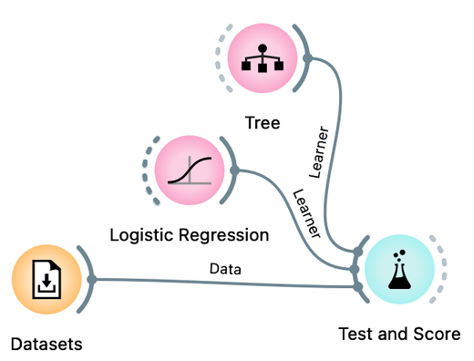
We use the term learner here. Learner is an algorithm that can receive a data set and develop a classification model. The classification model is therefore a product of the learner when applied to a given training data. The Test and Score widget accepts a learner (and not a model) as its input, because within this widget the data is split into training and test sets several times, each time applying a learner to the training set and testing in on the remaining test set.
Turns out the accuracy on the test set depends on the test set :). This is not surprising. But if we want to report back to Janez what is the expected accuracy of the logistic regression model on his cycling data, which accuracy should we report? The highest or the lowest obtained by repeated sampling? Neither would be good. Instead, we can report the accuracy averaged over multiple samples. It would be tedious to calculate these averages by hand. Instead, Orange offers a Test and Score widget that takes the data, the learning methods (e.g., the tree or logistic regression learner), and repeats the data sampling, training, and testing procedure several times, reporting the averaged classification accuracy.
The workflow we will use to estimate the accuracy of logistic regression and compare it to the accuracy of the tree is shown below:
Compare the estimated accuracy of logistic regression and the tree learner. Experiment with different prunning parameters of the tree. (1pt.)
Great. This confirms our intuition from the scatterplot visualization that logistic regression, a simpler model, will work well on our data set.
One last note before we close this chapter: Test and Score includes various means of splitting the data. In machine learning, the most popular is called k-fold cross-validation, where the data is divided into k roughly equal groups. In each iteration, one of the groups is considered the test set, and all other groups form the training set. The results are averaged over k such trials, each time considering a different test set. This is slightly different from random sampling, where data instances may appear in test sets many times, or perhaps never. Cross-validation ensures that each data instance appears in exactly one of the test sets.
Chapter 7: Multidimensional Data
Janez's Strava record actually contains data variables other than just distance and time. Check out the "Gravel vs: Data from Strava" datasets available in the dataset widget:
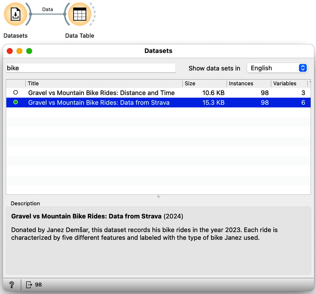
How many independent real variables does this data set contain? Ignore the bike classification variable, which is a dependent variable. (1pt.)
In the previous chapter, the data contained only two independent variables. We could plot the data on a scatterplot and find a line - a linear model - that separated the two types of bicycles that Janez takes on his trips. Now the data lives in five dimensions, and instead of the line, the decision boundary is now a hyperplane. This is still a linear model, actually a weighted sum of our features, and we can still use logistic regression for our classification. Except we can no longer see the decision boundary. But ok, at least we know how to estimate the classification accuracy:
What is the estimated accuracy of logistic regression on the Janez's Strava data set? Use five-fold cross validation for estimation in the Test and Score widget. Report on accuracy in percents, rounded to an integer (say, 67, if the accuracy reported by the widget is 0.668). (1pt.)
We can now experiment with different sets of features; that is, we can include some of the five features from the data set and see how the model performs with the remaining set of variables in the data. We will use Select Columns for this task. For example, we can tell it to build a model using only information about altitude and number of photos taken:
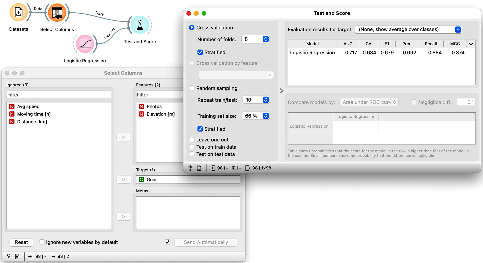
Note that using just these two features, the cross-validated classification accuracy drops to 68%.
Which of the following feature sets is the most informative, i.e., gives the best cross-validated accuracy? (1pt.)
One last note here. There is a nice visualization of the logistic regression model called a nomogram. It is possible to visualize logistic regression because its probabilities depend only on the distance from the classification boundary. And since the boundary is linear, the distance is actually expressed as a weighted sum of the features. The only remaining question is how logistic regression transforms this distance into probabilities, and in order not to make this chapter too long, let us just say that this is done by a logistic function. Hence the name: logistic regression. Oh, here is the nomogram:
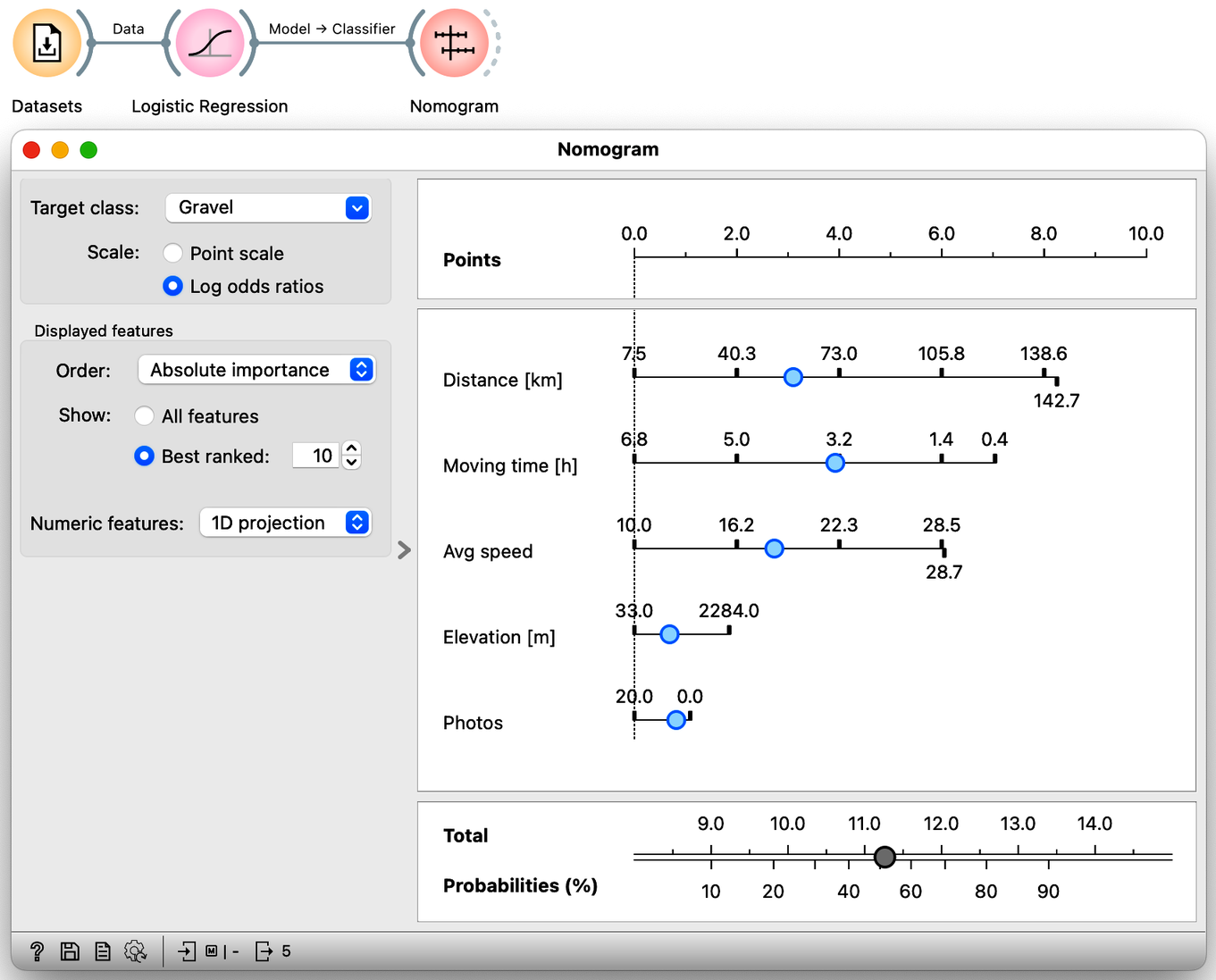
Nomogram can convert any choice of feature values into class probabilities. This one calculates the probability that Janez will take a gravel bike on his trip. We can see that distance, travel time and average speed are the three most important features for the prediction.
What is the probability that Janez will take mountain bike on a 70 km four-hour ride, where he will push for an average speed of 15 km/h for elevation of about a 1000 m. He promises to take 10 photos. (1pt.)
Nomograms are great tools. In medicine, a combination of logistic regression and a nomogram is still the most commonly used predictive model of all, despite the emergence of other AI-based techniques. Not that the latter are all that different from logistic regression. As we will learn next, today's AI is just a combination of many logistic regressions assembled into one big neural network. The problems we observed here, including overfitting, parameter estimation, feature selection and prioritization, and accuracy estimation, are no different and remain. At least we now understand them intuitively.
Chapter 8: What Else is Out There?
Congratulations on working through this course! We’ve covered some essential concepts in machine learning, including:
- Object Representation: (Almost) everything in the real world can be profiled and represented with numbers.
- Exploratory Data Analysis: Understanding and visualizing data for deeper insights.
- Estimation of Distances: Measuring similarities between real-world objects using their data-based profiles.
- Finding Neighbors: Using numerical representation and distance estimation to identify similar objects.
- Hierarchical Clustering (Unsupervised Learning): Grouping similar items and visualizing clusters.
- Classification (Supervised Learning): Building models to classify new data based on existing groups.
- Logistic Regression: Separating data classes with decision boundaries and evaluating model accuracy.
- Accuracy Assessment: Evaluating and comparing model performance using training and test datasets.
- Multidimensional Data Analysis: Handling data with multiple features and identifying informative feature sets.
So many new things! But there’s way more to explore. Machine learning offers a wide variety of clustering and classification techniques, along with approaches and scoring methods to estimate accuracy. There are also ways to explain what the resulting models do, and which data features are important or not. And everything we’ve learned can be applied to images, text, voice, music—anything that can be characterized with numbers. Since almost everything today can be described with numbers, as it turns out, you can use machine learning for just about everything. There’s so much more to learn!